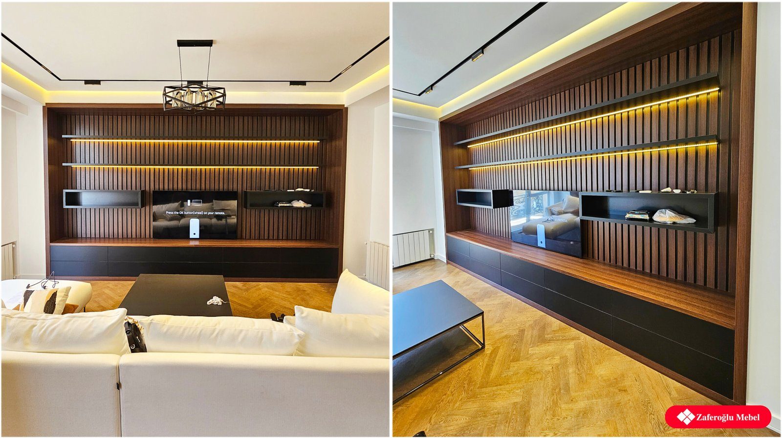

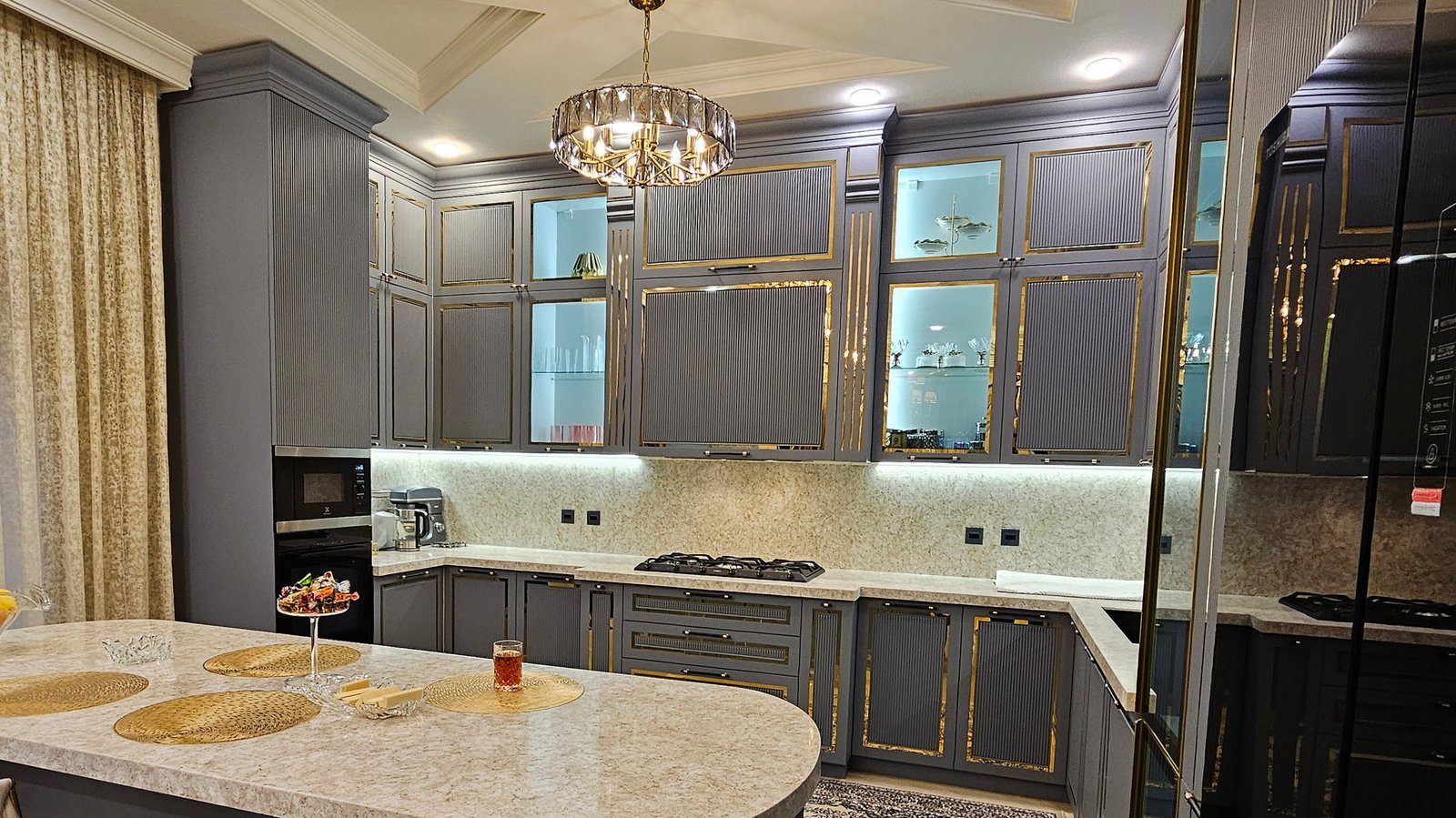
Fluted fronts have parallel vertical grooves or raised ribs across their surface. As light moves across them, a front looks livelier than a flat panel, and even a single-colour kitchen gains a rich texture. The effect has become popular on kitchen islands, TV units, sideboards and wardrobe doors. But texture is a strong design tool: in the right dose it gives an interior character, and overused it tires the eye.
How fluted fronts are made
The most common method is routing MDF. Grooves are cut into the surface at a set spacing, then the front is painted or wrapped in foil. This allows the width and depth of the flutes to be varied, and painted versions come in practically any colour.
The second method is gluing profiled veneer or timber slats onto a base board. Natural wood grain shows, but the material needs more careful protection from moisture and sunlight.
Glass can be fluted too: reeded glass blurs whatever is behind it without hiding it completely. For display cabinet doors and sideboards, it is a middle ground between open shelving and solid doors.
Where fluted fronts work
Fluting works best as an accent. Some successful uses:
- The seating side or end panel of a kitchen island, with the main fronts kept flat so the island becomes the focal point.
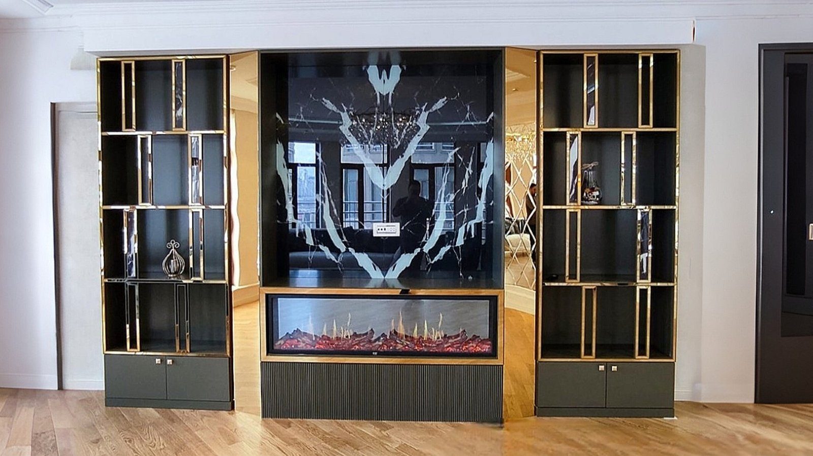
- The lower cabinets of a TV unit, especially against a smooth or plainly painted wall.
- A headboard or dressing table drawers in the bedroom.
- A narrow shoe cabinet in the hallway, where even a small area gives the entrance character.
- A sideboard or the lower doors of a bookcase in the living room.
In these cases the fluted surface is set against flat fronts and a simple stone or laminate worktop, standing out through contrast.
Where they overwhelm
Problems usually start when texture is applied everywhere. If every upper and lower kitchen front is fluted and the splashback is patterned tile as well, the eye has nowhere to rest. In a small room, dense deep flutes make a surface seem to vibrate, especially under side lighting.
Another risk is mixing styles. Fluted fronts combined with classic routed doors, veined marble and lots of decorative elements make an interior heavy. A simple question helps before deciding: what other textures are already in the room? If the answer is many, limit fluting to a small area. Trends matter too: a kitchen is used for many years, so calm fronts on large surfaces that are hard to change, with fashionable textures on small parts that are easy to update, is the more far-sighted approach.
Scale and rhythm
Flute width should suit the size of the front. On wide doors, very narrow flutes read as a grey tone from a distance and the effect is lost; on narrow cabinets, wide flutes can look coarse. Flutes that continue from door to door without breaking rhythm are a sign of quality work, which requires calculating door sizes around the flute spacing.
Handle choice matters as well. A conventional handle fixed to a fluted surface interrupts the rhythm, so handle-free opening, a concealed profile along the top edge or a small, understated handle is often chosen.
Care
Grooves collect dust and, in kitchens, grease droplets, and unlike a flat front they cannot be wiped clean in one pass. For daily cleaning, work a soft brush or microfibre cloth along the flutes. For greasy marks, a well-wrung cloth dampened with mild soapy water followed by a dry cloth is enough. Abrasive sponges rub paint and foil shiny along the groove edges. For that reason, in kitchens it is practical to use fluted fronts away from the area right beside the hob.
Zaferoglu Mebel makes kitchen, TV unit and wardrobe fronts to individual designs, so where fluting works best as an accent can be tried out on the drawings first.