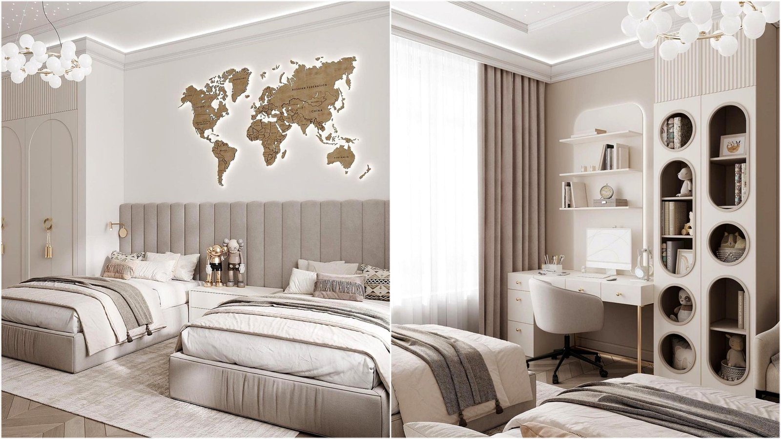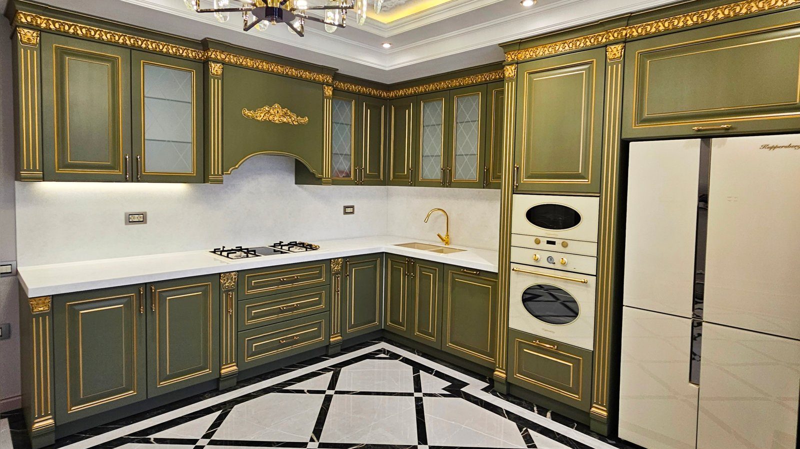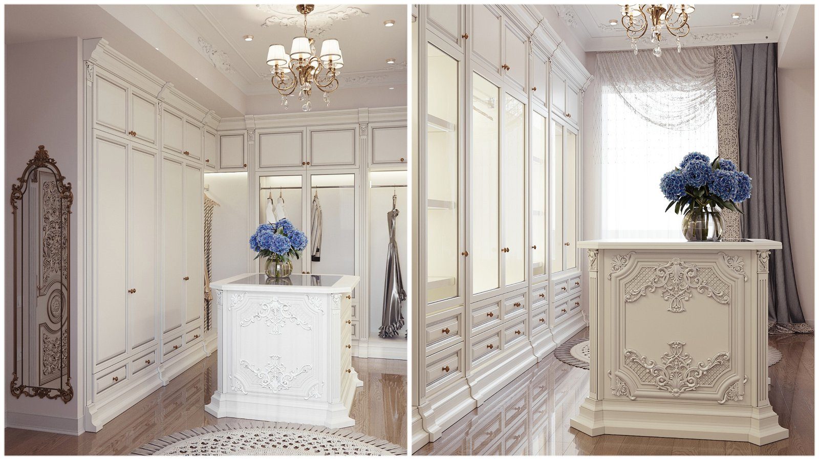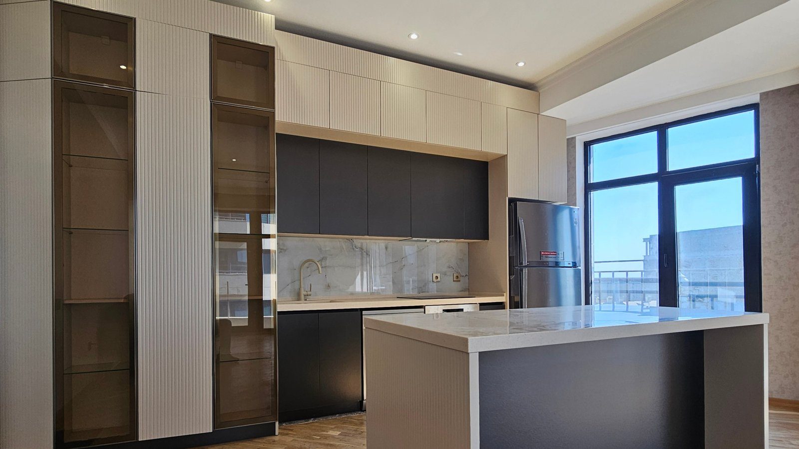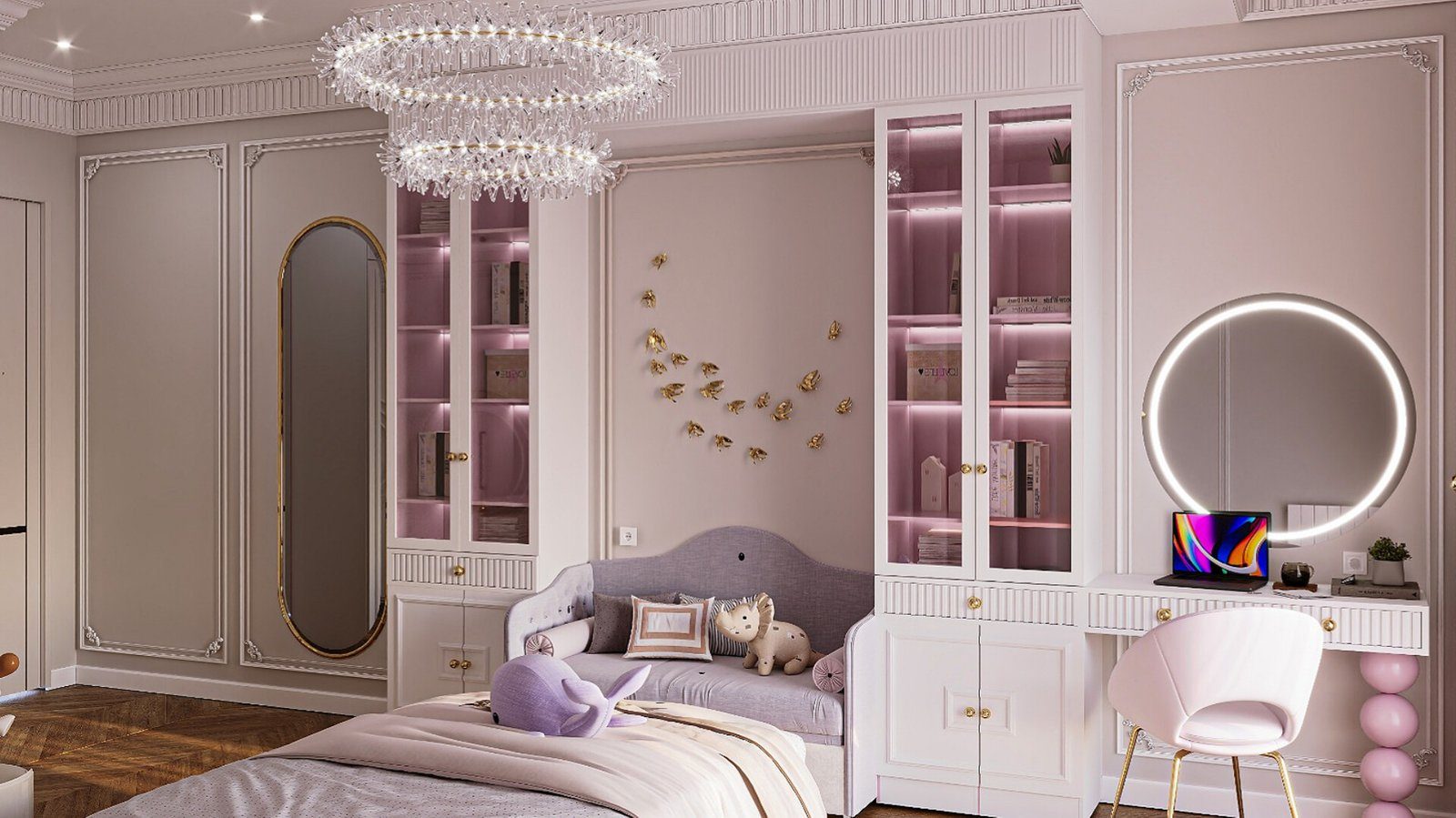

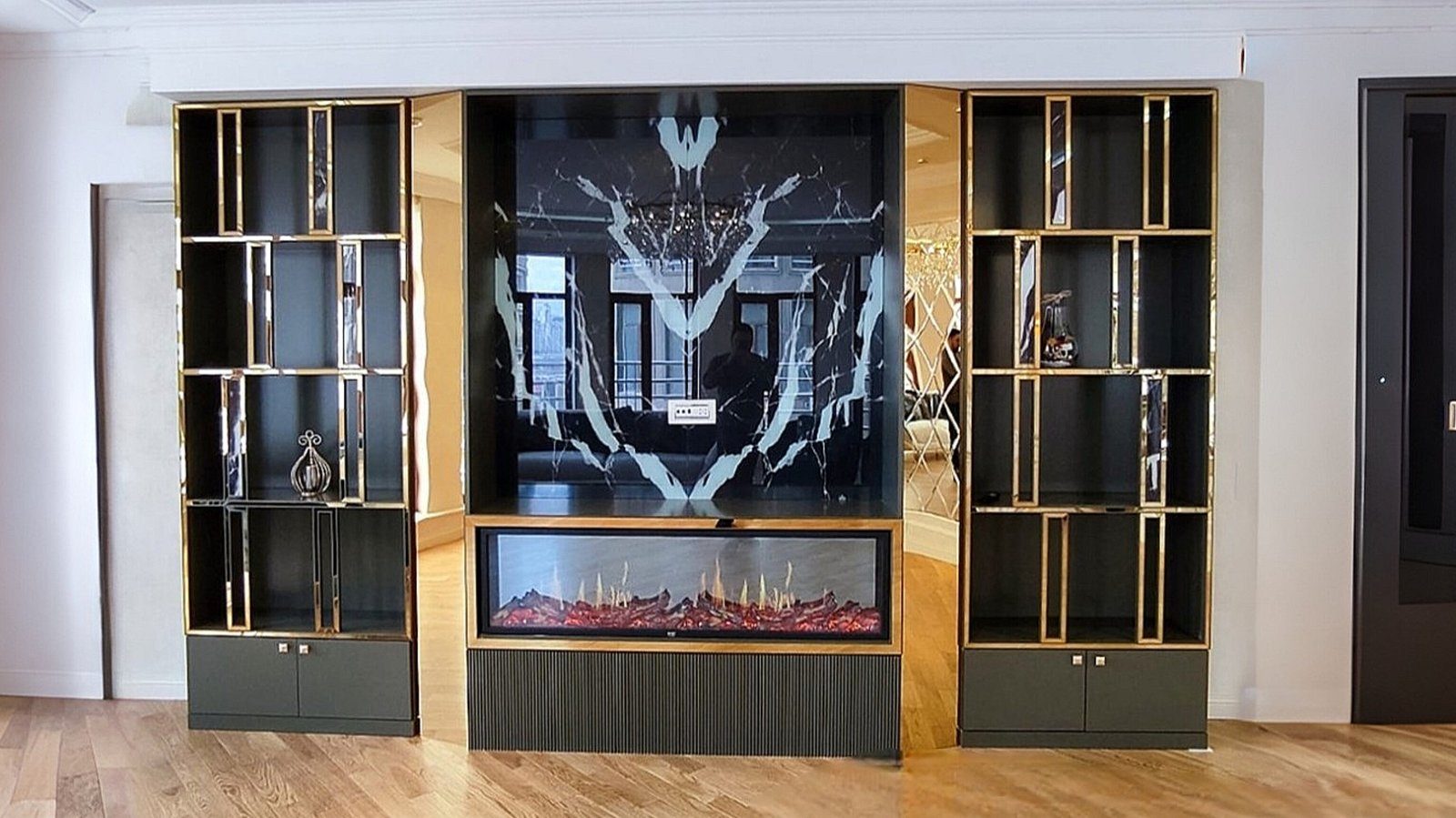
For years, light tones dominated made-to-order furniture: white, beige and light wood decors. More recently, graphite kitchen fronts, walnut TV units and wardrobes with black metal details are chosen more and more often. Dark furniture adds depth, calm and a certain gravitas to an interior. But these tones also show mistakes more readily: in the wrong light, a room looks small and gloomy, and dust and fingerprints stand out. Using dark colours well means understanding their character and the rules of balance.
Three dark tones, three characters
Graphite is a cool, neutral grey. Less harsh than black, it looks modern and technical and pairs well with concrete, metal and white surfaces. It is widely used for kitchen fronts, office furniture and minimalist living rooms.
Walnut is a warm brown wood tone. Its grain adds life to a surface, and despite being dark it does not make a room feel cold. It works equally well in classic and contemporary interiors and is popular for TV units, bookshelves, bedroom furniture and home offices.
Black is the most contrasting tone. Matt black fronts look calm and refined, while gloss black looks dramatic. In small amounts, such as details, handles and frames, black creates a strong accent; on large surfaces it needs careful balance.
Room size and light
The first factor to check is light. In a room with large windows and good daylight, graphite or black fronts look beautiful. In a small, north-facing room with small windows, the same fronts swallow the space and need artificial light even by day.
Room size matters too, but contrary to popular belief, dark colours are not always off-limits in small rooms. A dark, floor-to-ceiling wardrobe along a whole wall can blur corners and boundaries and make a small space feel deeper. The key is to concentrate dark tones on one or two surfaces and keep the rest light.
Balance: backgrounds, floors and worktops
Dark furniture looks best against a light background. Light walls, floors or worktops create contrast and make the furniture's form legible. Combining dark walls, dark floors and dark furniture works only in very well-lit, large spaces.
Common kitchen combinations include:
- Graphite base units with light wall cabinets or open shelves.
- Black fronts with a light stone-effect worktop and splashback.
- Walnut fronts with a white or light grey worktop and matt black handles.
A palette of two or three tones is usually enough. Mixing dark furniture with many different wood decors creates visual clutter.
Metals, textiles and lighting
Metal details draw particular attention against a dark background. Graphite suits silver and black metal, walnut suits bronze and gold tones, and black goes with almost any metal. Repeating the same metal tone in handles, lamps and furniture legs makes an interior feel coherent.
Lighting plays a bigger role with dark furniture. LED strips under wall cabinets, concealed lighting in open shelving and sensor lights inside wardrobes bring dark surfaces to life and add practical comfort. Textiles such as rugs, curtains and cushions soften the severity of dark furniture.
Practicality: dust, marks and care
Dark surfaces show everything: dust, fingerprints, water droplets and grease marks. This is especially noticeable on gloss black and graphite fronts. A few tips for a practical choice:
- In kitchens, choose matt or anti-fingerprint surfaces rather than gloss.
- A textured walnut decor hides marks better than a flat dark colour.
- Handle-free fronts collect more fingerprints, so factor that in.
- A microfibre cloth and a mild cleaner give streak-free results on dark surfaces.
Scratches also show sooner on dark surfaces. For lower edges knocked by chair legs and shoes, consider more durable materials or protective profiles.
Zaferoglu Mebel builds kitchens, TV units and wardrobes to individual designs in many decors and colours. To judge a dark shade properly, look at the sample in the light of your own room before deciding.