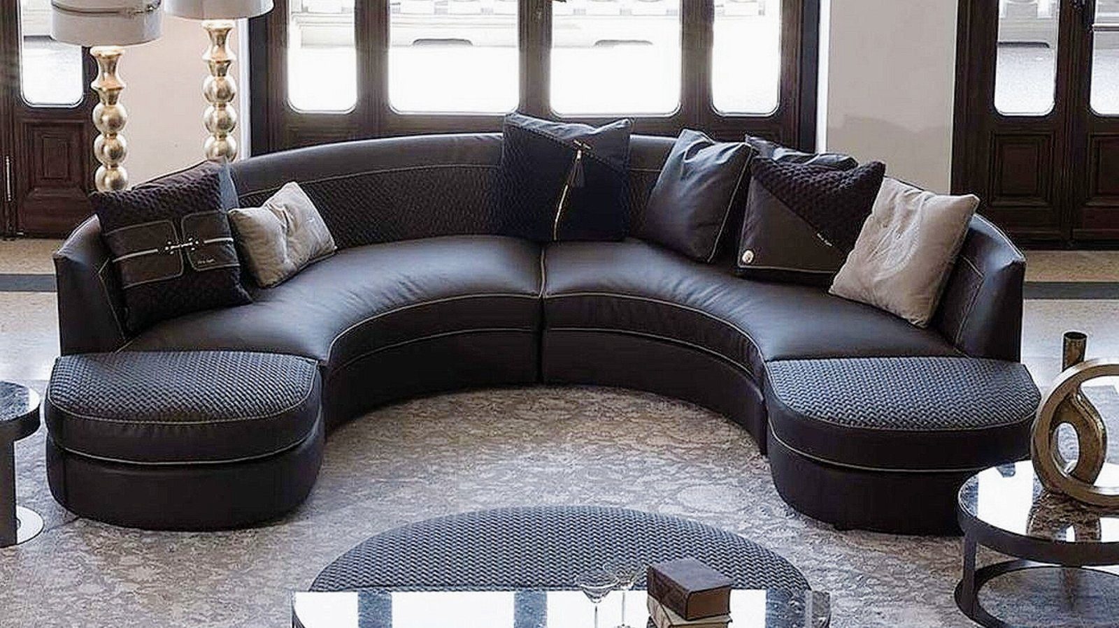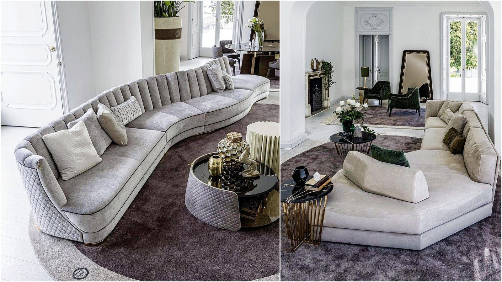

A gold-coloured handle, a slim brass profile or a metal leg instantly changes the character of a piece of furniture. A gleaming line on a dark front makes an interior look warmer and richer. That very effect is the risk: with too many gold details the eye gets tired and the room looks crowded rather than luxurious. The secret of working with metal accents lies in choosing their amount, finish and background correctly.
Finish: polished, brushed, antique
“Gold” is not one colour but several distinct looks:
- Polished brass shines like a mirror and reflects light strongly. It is natural in a classic interior and works better in small doses in a modern one.
- Brushed or satin brass has a soft, muted sheen. It shows fewer fingerprints and blends more calmly with modern fronts.
- Champagne gold is lighter and cooler, and looks refined against white, beige and light grey.
- Antique or aged bronze is a dark tone leaning towards brown that forms a warm ensemble with wood and dark colours.
You can mix finishes from the same metal family in one room, such as brushed handles with a polished lamp, but the tones should be close. Yellow gold next to rose gold usually looks like an accident.
The rule of repetition: once is chance, three times is a system
A single metal detail in a room can look like something left there by mistake. When the same metal appears in two or three different places, the eye reads it as deliberate design. In a kitchen, for example:
- the front handles;
- details on pendant lights or the tap;
- open shelf brackets or a display cabinet frame.
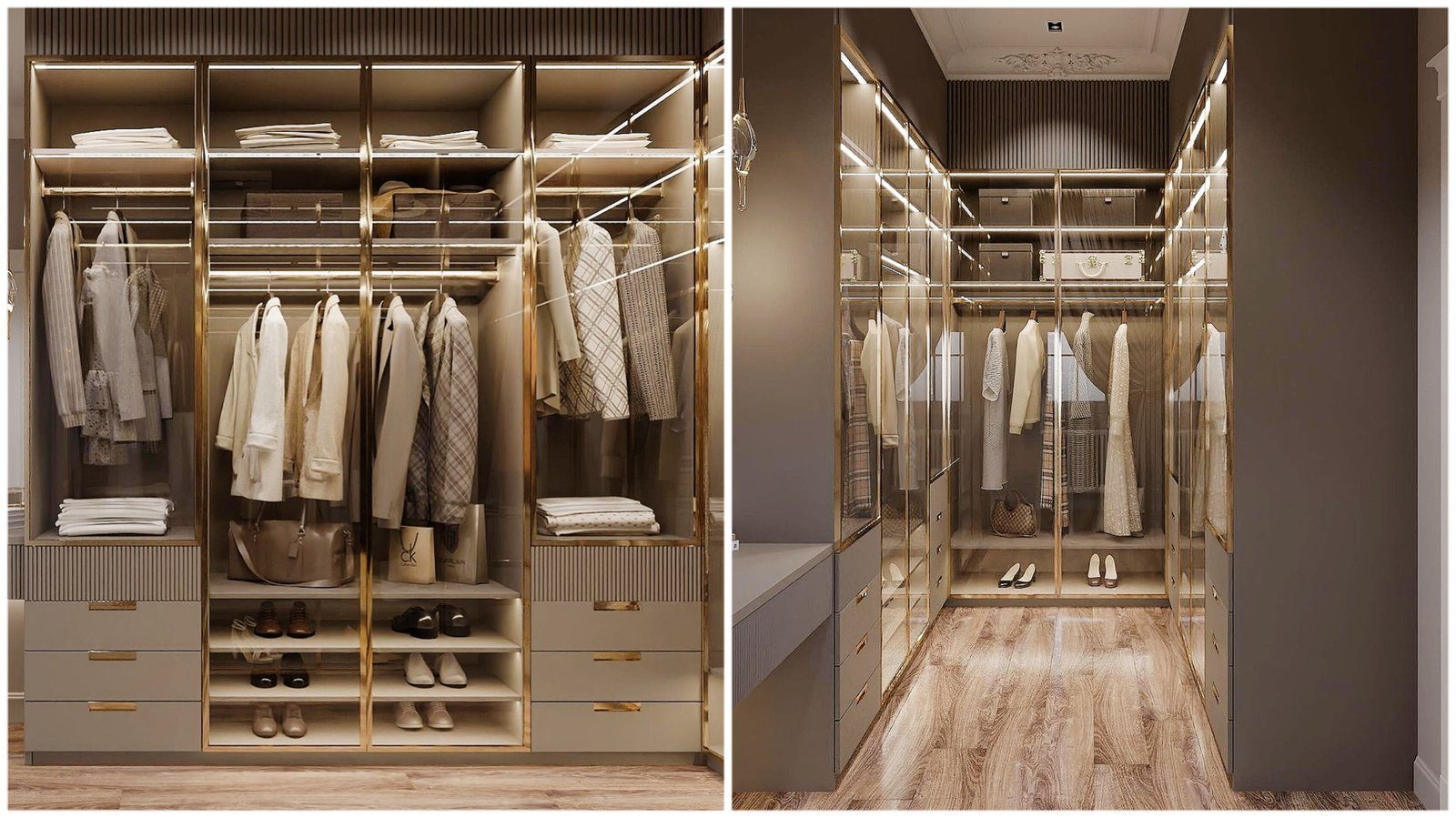
That does not mean everything should be gold. A practical approach is to keep the main surfaces — fronts, walls, floor — neutral and let metal appear only as lines and points: handles, trims, legs, lamps. A large metal surface, such as a full brass panel, is used in one place only, as a focal point.
The background decides the metal’s fate
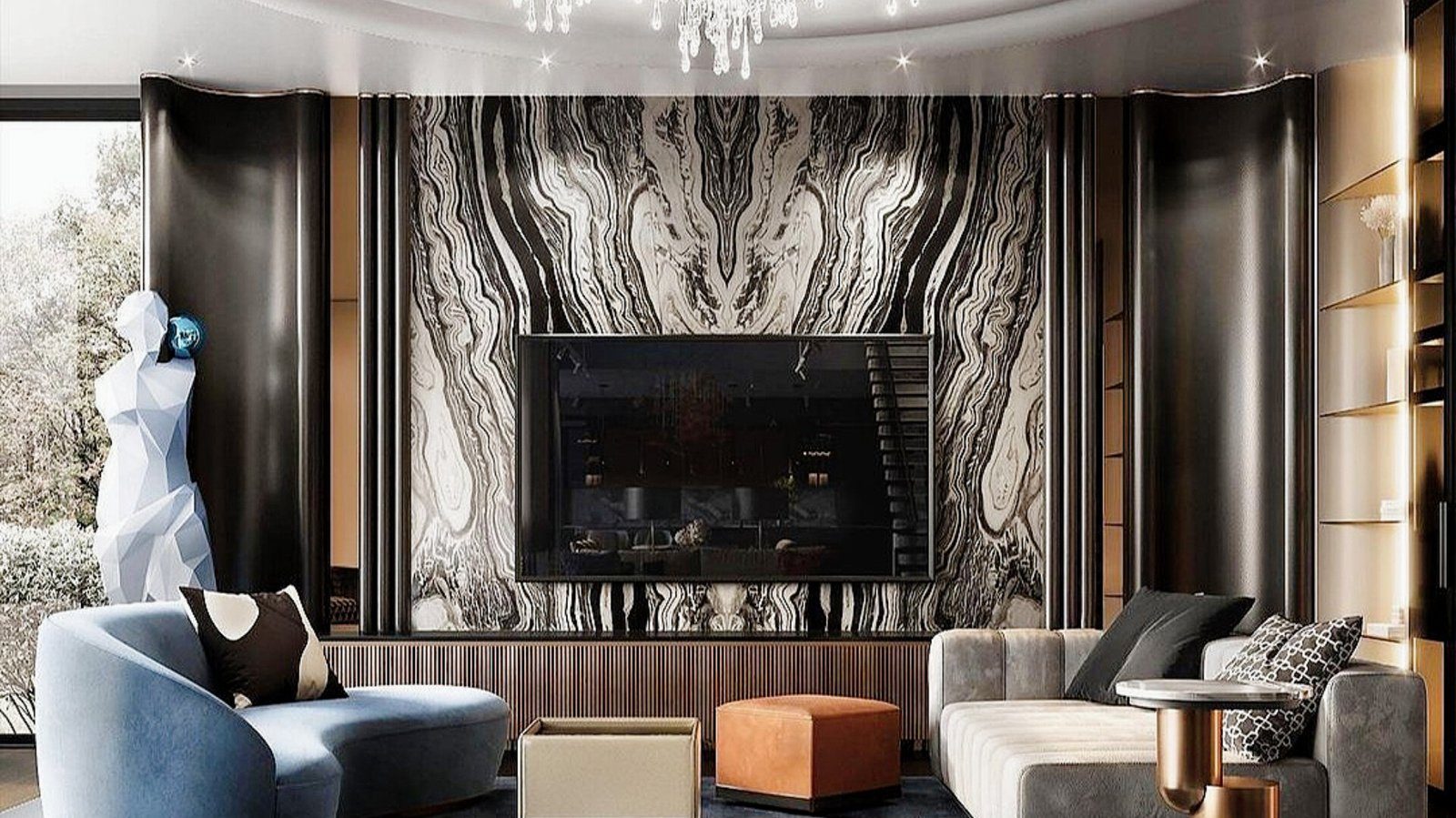
A gold detail looks completely different depending on what surrounds it. Against dark backgrounds — graphite, black, navy, emerald or deep olive — the metal glows and is at its most expressive, so even a small detail is enough. Against white and light colours it reads as more delicate and light, and because the contrast is lower, details can be slightly larger or more numerous.
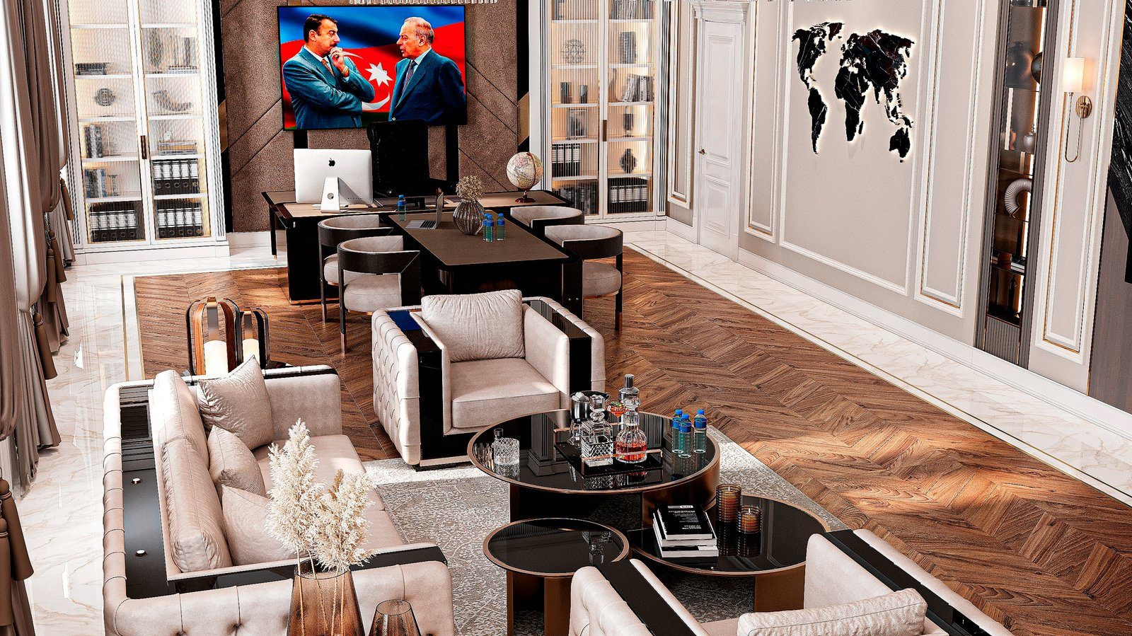
On wood, especially walnut and dark oak, brass makes a natural, warm combination. Against cool greys and blues, gold details create contrast, but unless that contrast is supported elsewhere, for instance in textiles, the detail can look out of place.
Classic versus modern interiors
In classic styling, gold has traditionally been part of the ornament: on carved cornices, pilasters and the trim of framed fronts. The dose can be larger here, but one principle still holds — when carving, patina and gilding appear on every surface at once, the detail loses its value. Keep gold for the most visible parts, such as the upper cornice and central fronts.
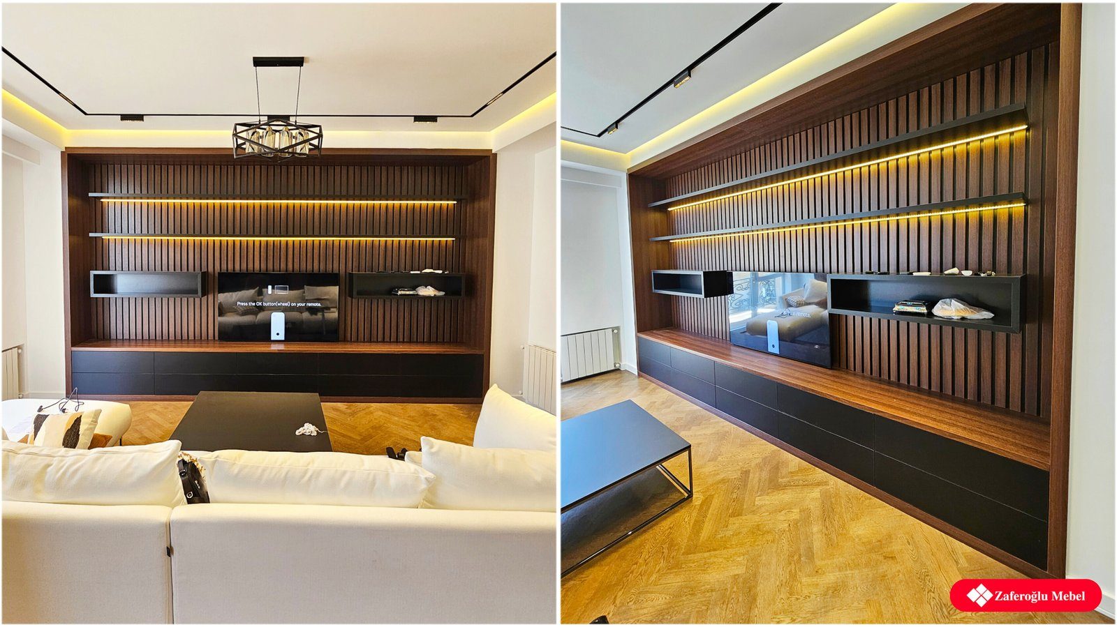
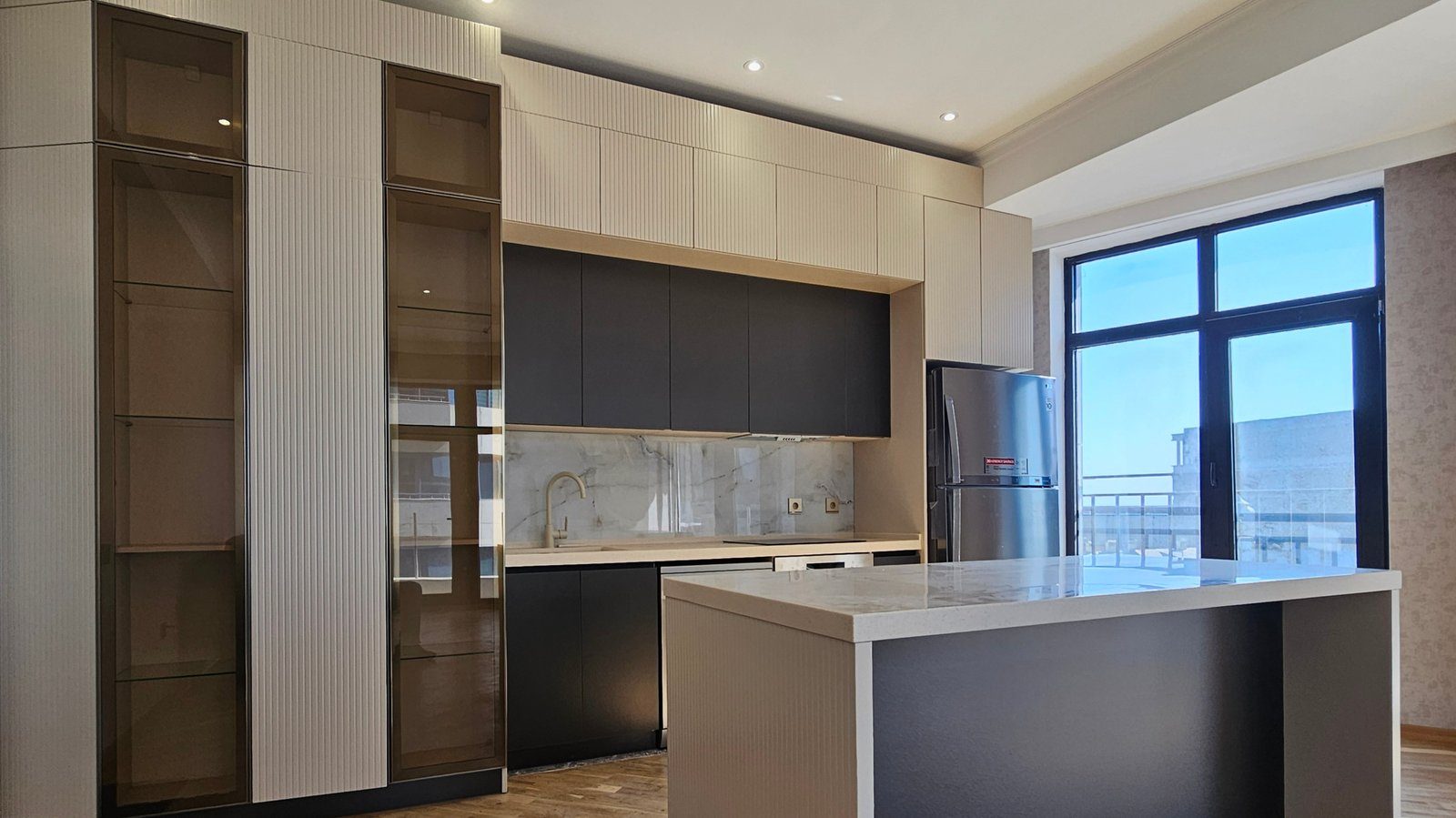
In modern interiors metal plays a more graphic role: a thin profile between fronts, a line along the edge of a fluted front, a simple long handle. Slim lines and details that emphasise the furniture’s geometry matter most here.
Durability and care
Gold-look hardware is produced in several ways: solid brass, plated zinc or steel, vacuum-deposited PVD coatings and others. On details touched daily, like handles, the durability of the finish is important. Unlacquered solid brass darkens and develops a patina over time; some see that as a virtue, others as a flaw.
General care rules:
- do not use abrasive powders or hard scourers;
- keep chlorine-based and acidic cleaners away;
- wipe with a soft damp cloth and dry with a dry one.
To decide, hold a metal swatch against a front sample in the light of the room itself.
Zaferoglu Mebel suggests choosing handles, profiles and decorative metal details together with the front colour at the design stage, so the amount of metal accent is balanced across the whole set of furniture in advance.