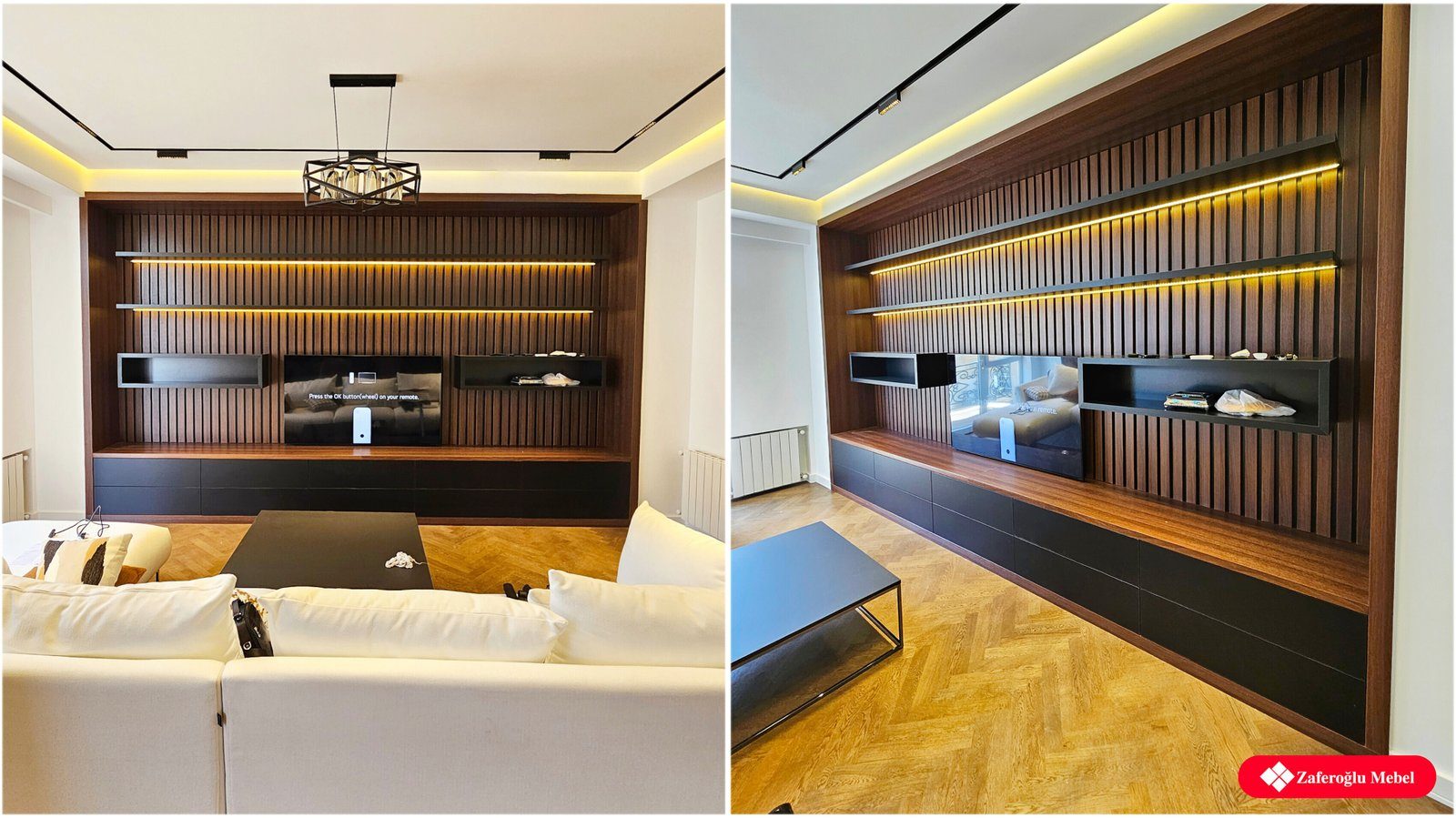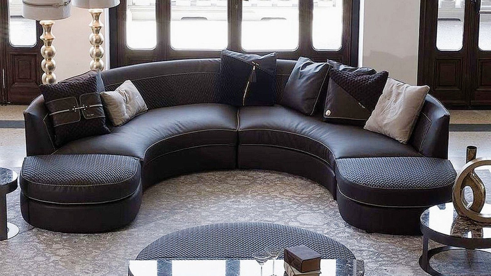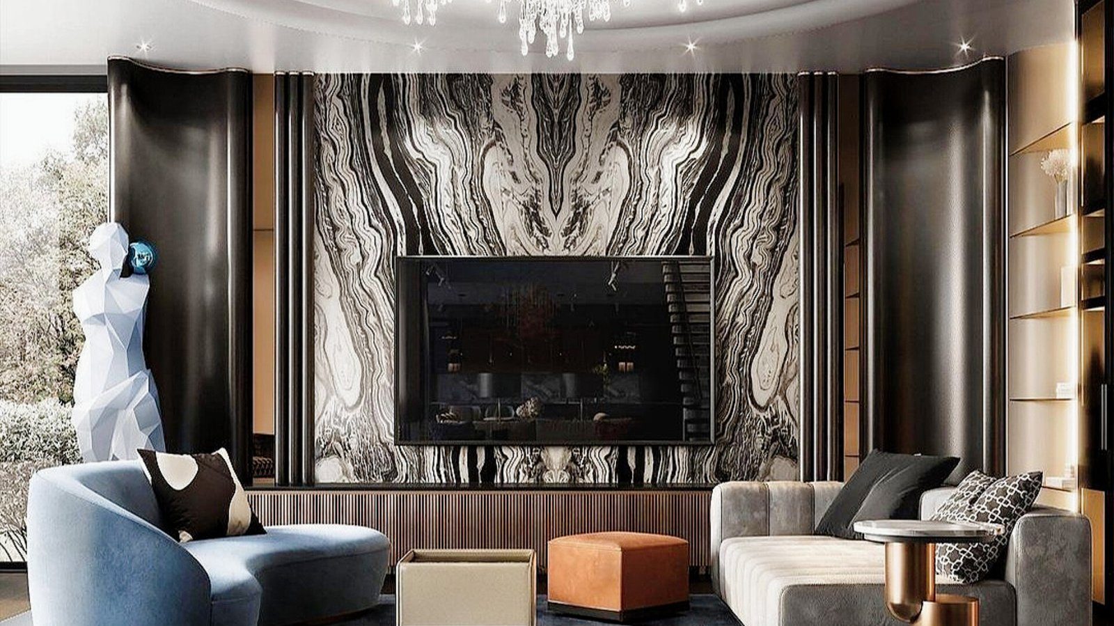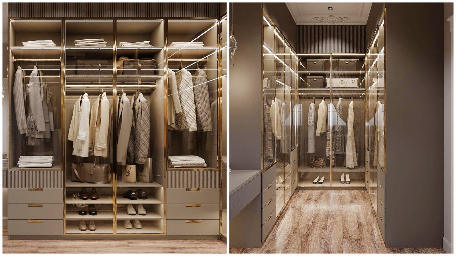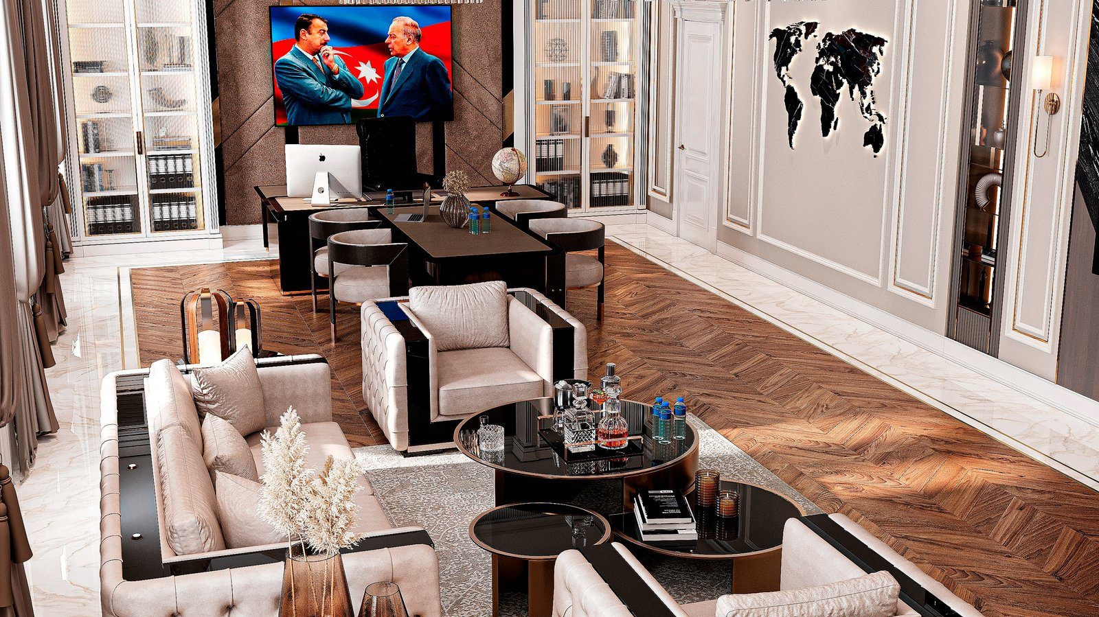

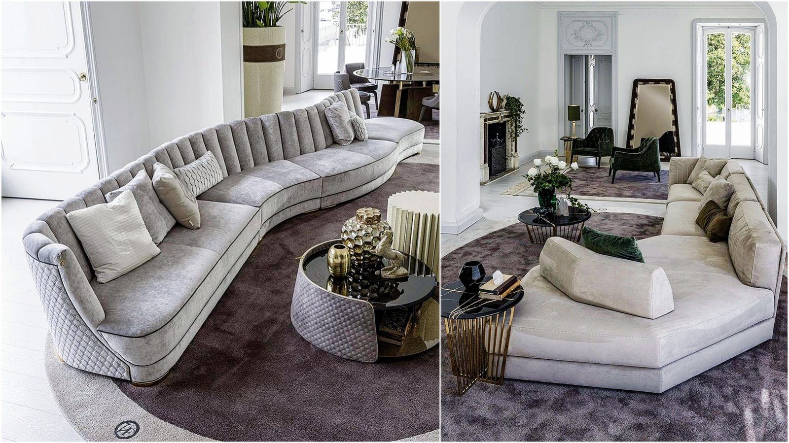
What makes an interior look alive in a photograph is often not colour but texture. The same beige room looks cold and sterile when every surface is smooth, and warm and lived-in when wood, woven fabric and rough stone come together. But as the number of textures grows, so does the risk: when every element demands attention, the eye finds nowhere to rest. Here are practical rules for getting materials to work together.
The visual weight of texture
Every material carries visual weight. Rough stone, deep-pile fabric and wood with a strong grain draw the eye and feel heavy in a room. Smooth lacquer, polished metal and finely woven fabric feel light and calm.
For balance, heavy and light textures should complement each other. If there is a rough stone panel along one wall, furniture opposite with smooth fronts lets the stone stand out. When both sides are highly textured, they compete for attention.
Main, supporting and accent materials
One practical approach is to give materials three roles:
- the main material covers the largest surfaces: floor, wall panelling and large wardrobe fronts;
- the supporting material complements it and repeats in secondary areas, such as sofa upholstery or a tabletop;
- the accent material is used in small amounts but in visible places: metal legs, handles, lamp details, a small stone surface.
In a living room, for example, the main material might be warm wood-decor fronts and flooring, the supporting material a light woven sofa fabric, and the accent matt black metal legs and a stone coffee-table top. When the proportion slips and the accent material appears everywhere, it stops being an accent.
Wood against wood: clashing tones
One of the most common mistakes is a random mix of several wood tones in one room. When the floor is one shade, the TV unit another and the table a third, they look like wrong choices, because they are close but not the same.
There are two ways out. The first is to keep all wood within one tone family, for example all warm honey shades. The second is a clear contrast, such as dark walnut furniture on a light floor or the reverse. The in-between options are the hardest to manage. Grain direction plays a part too: horizontal grain on fronts widens a room, while vertical grain emphasises height.
Stone and metal: dosing cool materials
Stone, metal and glass are cool materials. They bring clarity and a modern feel, but in large amounts a room can start to look like an office or a public space. At home they need balancing with fabric, wood and soft light.
Metal colour should also work as a system. Chrome handles, a gold lamp and bronze legs side by side in one room look accidental. Choosing one main metal finish and using a second very sparingly and deliberately usually gives a neater result.
The role of fabric
Fabric adds both visual and acoustic softness. Sofa, armchair, curtains, rug and cushions should agree in texture. Velvet, linen, bouclé and leather can all appear in one room and look harmonious if their colours come from a close palette. When both colour and texture differ, the result is chaotic.
A practical rule is one main fabric on upholstered furniture and one or two different textures in cushions and throws. Because cushions can be changed, they are the least risky place to experiment.
Checks before deciding
- How many different materials are in the room, and which one plays the main role?
- Are the wood tones from one family, or do they form a clear contrast?
- Do the metal details follow one colour system?
- Are there enough smooth, calm surfaces for the eye to rest?
- Have the samples been compared side by side in the room's own light?
Zaferoglu Mebel makes upholstered furniture, TV units and wardrobes to order. Choosing textures by laying fabric, door and metal samples out together, rather than one at a time, gives the most reliable result.