
When a client walks into an office, their first impression forms at the reception desk, in the waiting area and along the corridor. The colours, logo and values in the brand book either match the real space here or live a completely separate life. Corporate identity is often reduced to a large logo on the wall and brand colour on a couple of armchairs. The result looks like an exhibition stand but does not convey the company's character.
Define the brand character in words first
Before choosing furniture and materials, it helps to describe the brand's character in a few words. A law firm wants to convey trust and stability, a tech company openness and speed, a design studio creativity. These words are then translated into furniture: dark wood, solid forms and calm tones for trust; light surfaces, metal and glass for openness; unusual shapes and a bold accent for creativity.
This approach keeps the office relevant even if the corporate colour changes, because character outlasts colour.
How much corporate colour
Brand colours are often bright and saturated because they were chosen for logos and advertising. Making every front or wall in that colour is usually tiring and weighs on the daily working environment. A more effective approach is to use the colour in measured doses:
- The front panel of the reception desk or one front element.
- The upholstery of one or two seats in the waiting area.
- Acoustic panels or chairs in the meeting room.
- Small details such as the inside of open shelves or cable duct covers.
The remaining surfaces stay neutral: white, grey, light wood. Against that background the brand colour reads more clearly. An exact match is not always possible when transferring a colour to furniture board or fabric, so samples should be checked in real light.
Speaking through materials
Materials send a message just as colour does. Natural wood grain suggests a warm, people-centred company. Concrete and dark metal strengthen an industrial, technical character. Glossy white surfaces are associated with cleanliness and precision, but used too widely they can create a clinical atmosphere.
Two or three main materials are enough for one office. Because furniture board collections list decors by code, decors chosen once can be repeated in every zone from reception to workstations, which makes it easier to keep the same style when opening a branch or expanding.
Reception: the brand's shop window
The reception desk is the brand's most visible piece of furniture. Its shape, material and lighting say the first sentence about the company. Placing the logo here makes sense, but building it into the furniture as an illuminated profile, a routed panel or an inlay in a contrasting material looks far better than a stuck-on sticker.
The reception desk is also a workstation: the back needs space for a computer, printer, documents and cables. The tidiness visible from the front depends on well-planned storage behind.
Workstations and meeting rooms
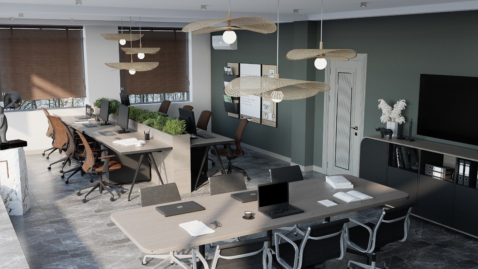
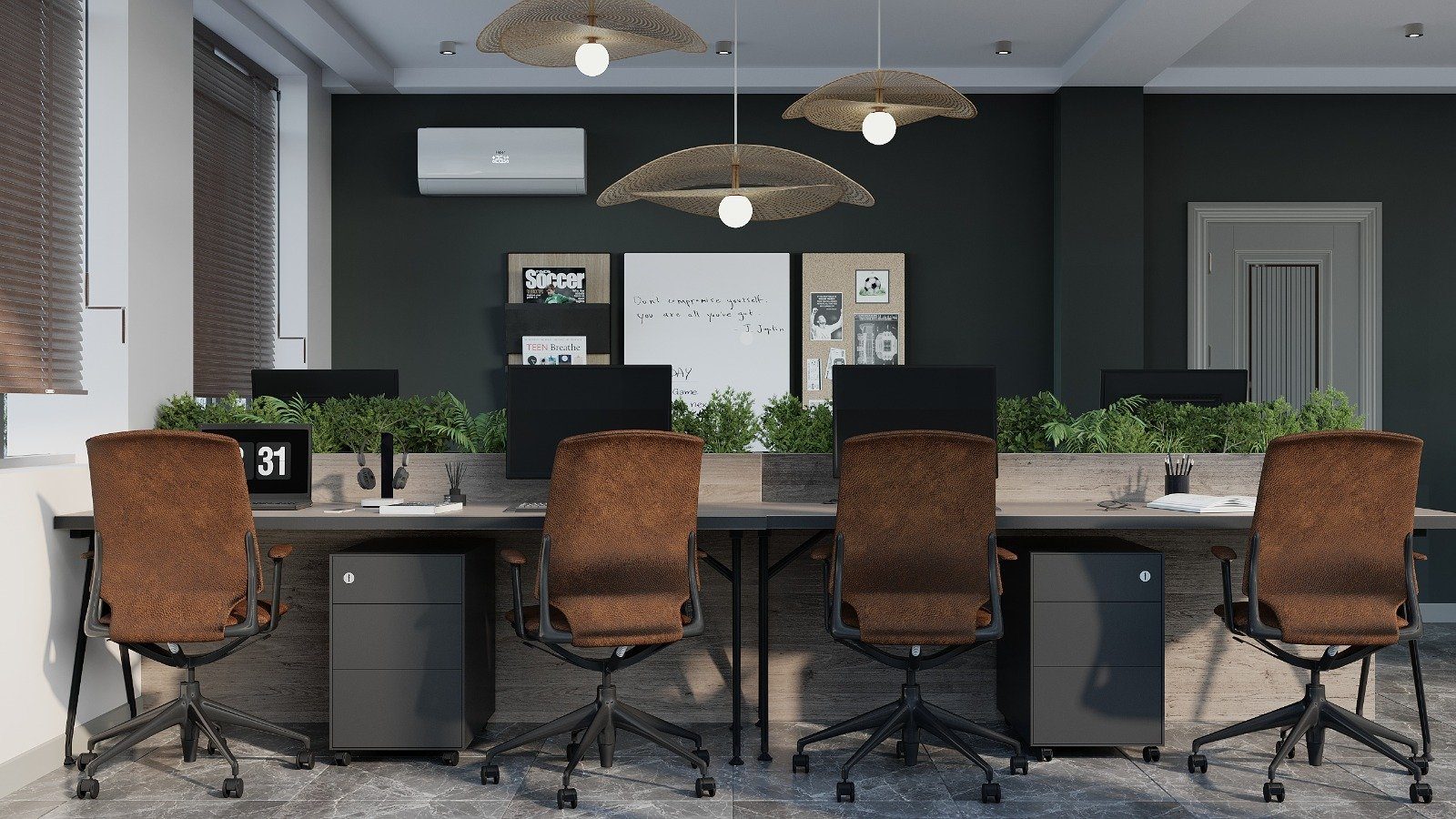
In the work zone, the brand should speak more quietly. Staff spend most of the day here, and bright colour is distracting over long periods. A softened shade of the brand colour can be used on desk screens, cabinet fronts or acoustic panels.
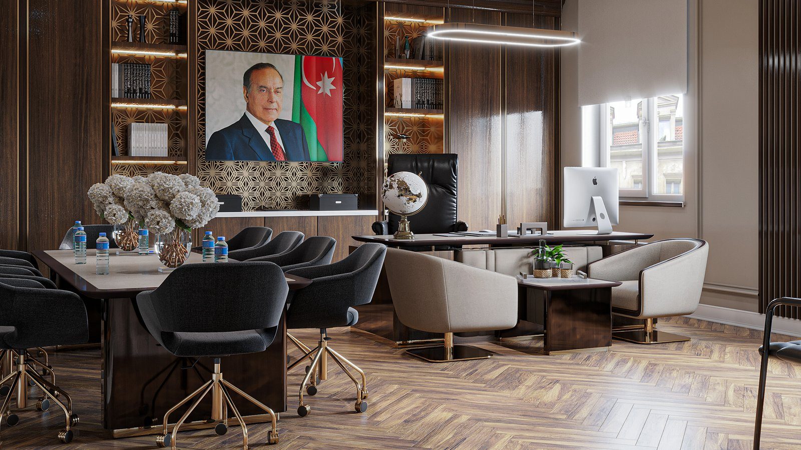
The meeting room is where clients are met, so the brand can speak more strongly again. The table top material, chairs and wall panelling are designed as one composition.
A long-term approach
Brands are refreshed and logos change, but furniture stays for years. It is therefore wise to concentrate corporate elements in parts that are easy to replace: removable front panels, seats that can be reupholstered, a separately mounted logo element. Carcasses, desk frames and storage systems stay neutral.
- Write down the brand's character in three words.
- List the surfaces where corporate colour will be used and limit their number.
- Choose two or three main materials and record their decor codes.
- Decide in advance which elements would be replaced in a rebrand.
When ordering office furniture from Zaferoglu Mebel, the many decors in the Egger and Kronopol ranges make it possible to find the closest match to brand colours while the layout is being planned.