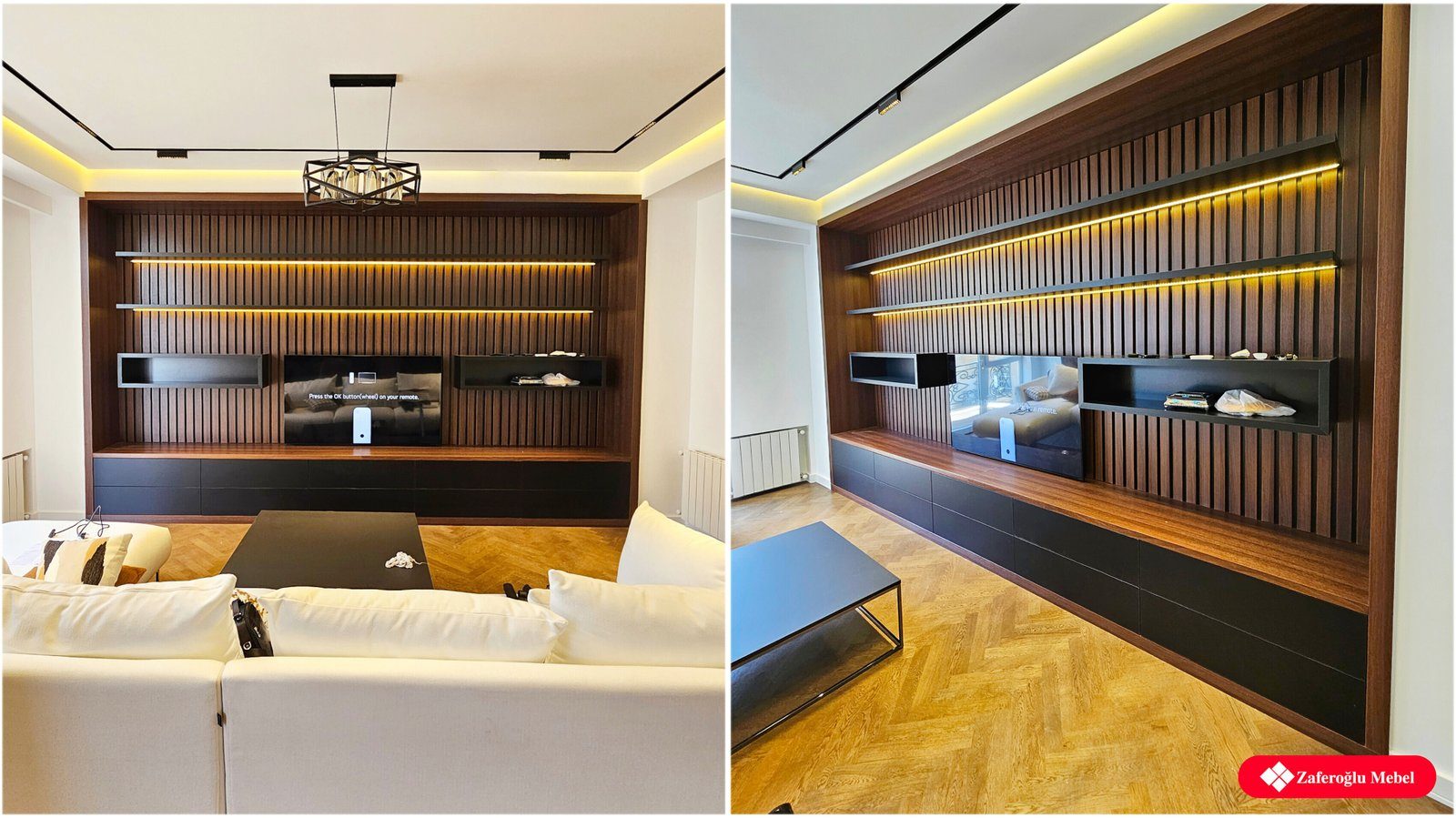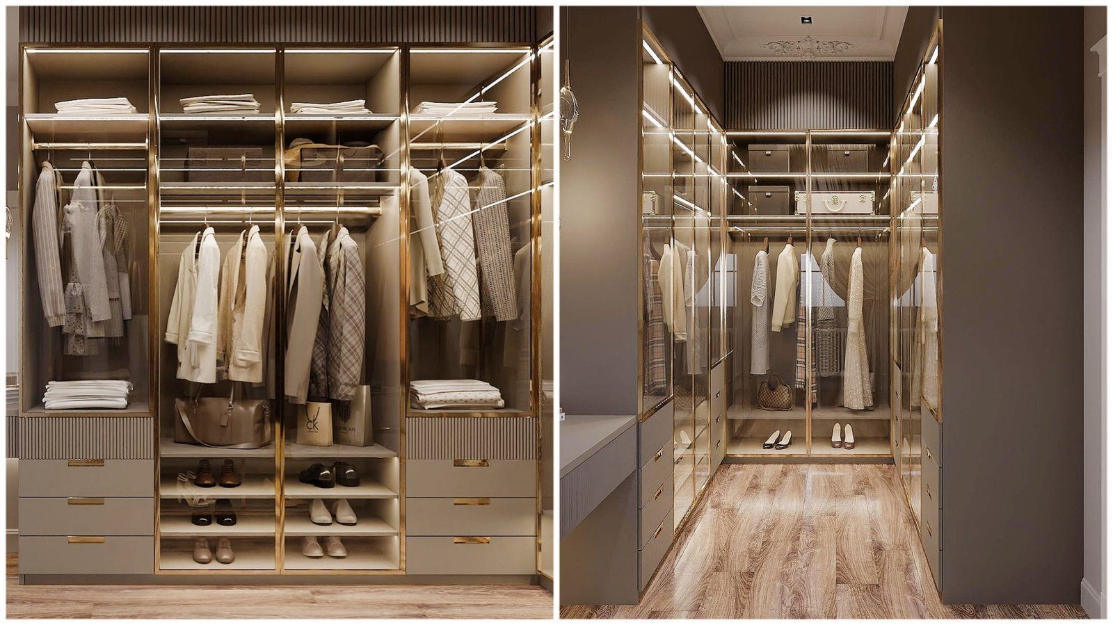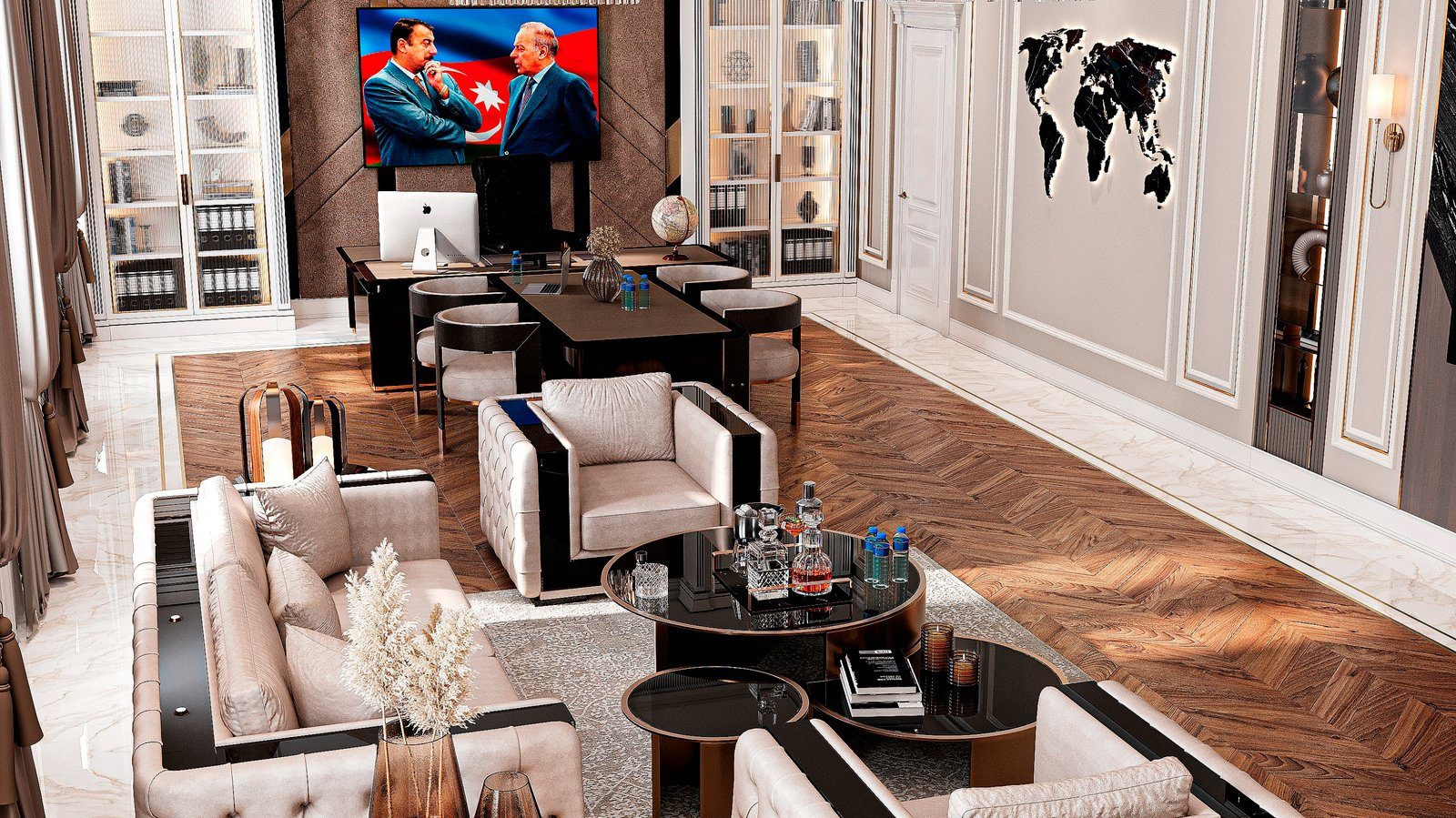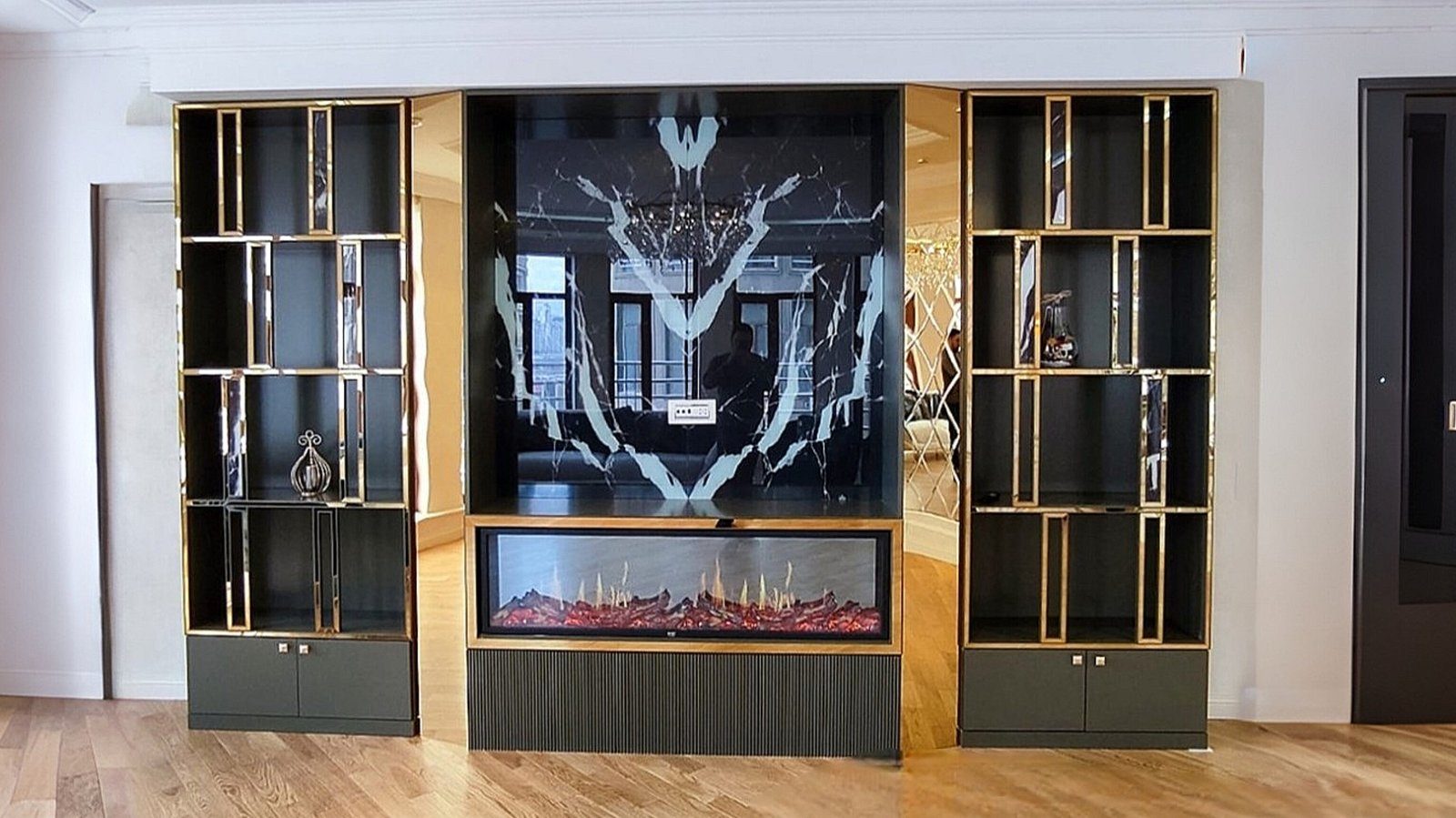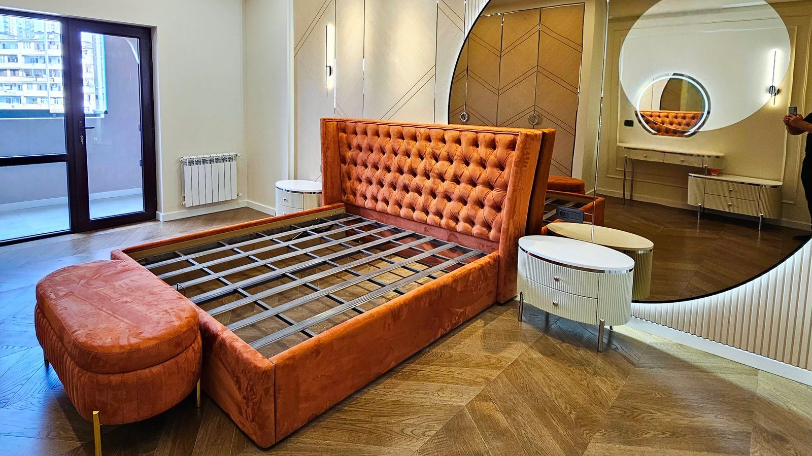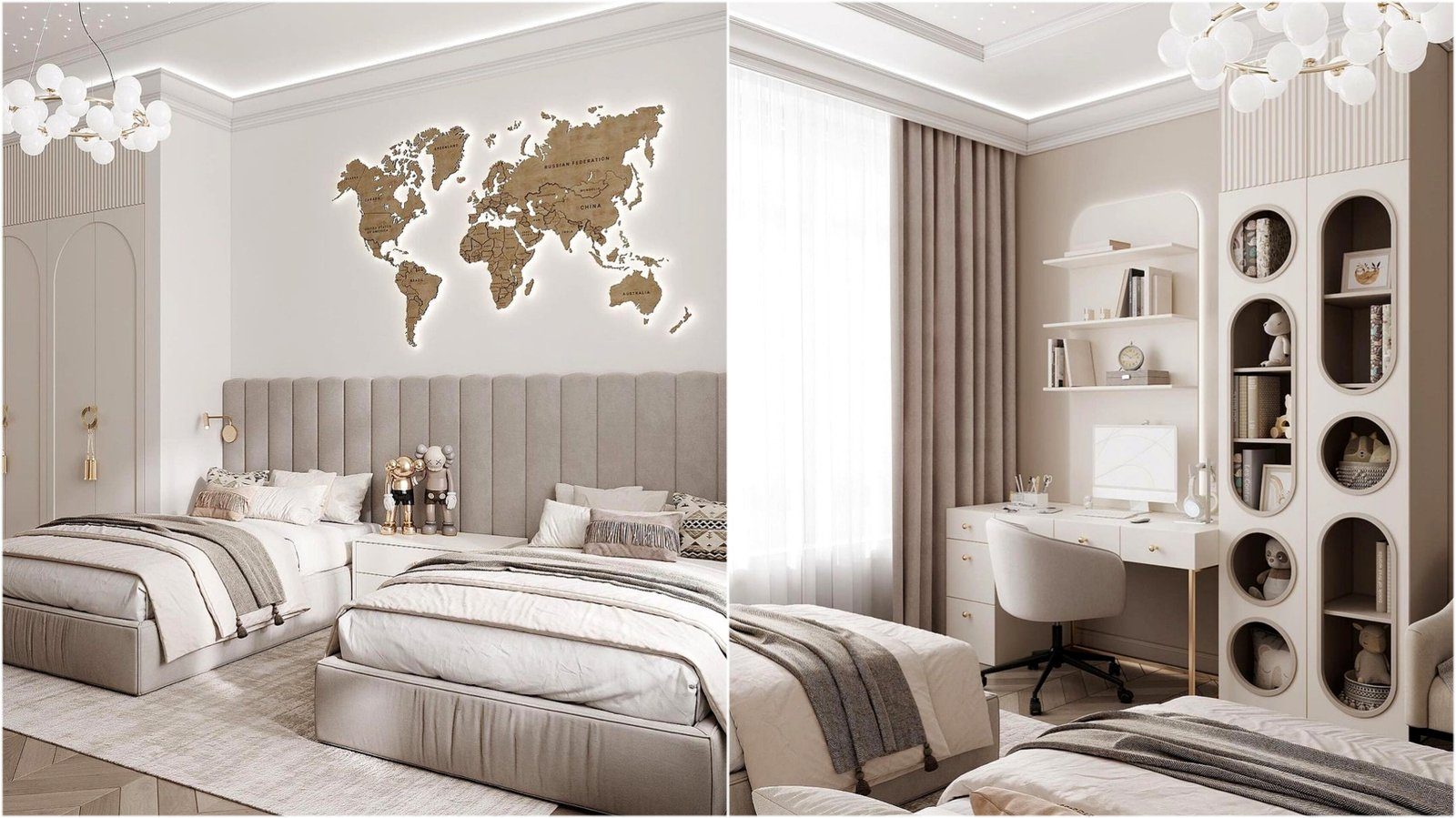

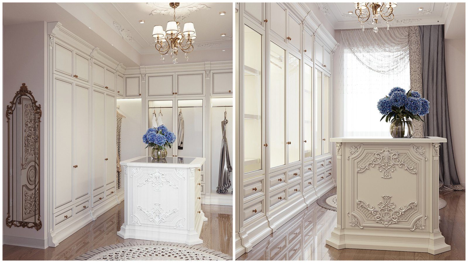
A small flat may need a floor-to-ceiling wardrobe or storage along an entire wall, yet nobody wants the room to feel heavy. One of the most effective techniques in such cases is to make the fronts the same colour as the wall. Done well, the eye reads the cabinet not as a separate object but as a continuation of the wall, and the room feels calmer.
Why the effect works
We read space mainly through contrasting edges. A dark wardrobe against a light wall has an outline that stands out instantly, and you feel its bulk. When colour and sheen match, the edge softens and the cabinet becomes part of the background. This is especially useful in hallways, narrow bedrooms and next to the TV wall in a living room.
The approach is not limited to white. Fronts made in the same beige, light grey, olive or even deep blue as the wall work on the same principle. With a dark shade the cabinet does not vanish completely, but it reads as depth in the wall.
How to match the colour
The main difficulty is that wall paint and furniture surfaces are different materials. Walls are painted with one system, fronts are finished with another, and laminated boards come from a fixed decor catalogue. There are two ways to match them:
- Paint the fronts to the wall. MDF fronts are sprayed in a lacquer matched to the wall paint code. Accuracy is high, but two different paint systems can look slightly different under certain light, so a sample test is essential.
- Paint the wall to the furniture. Choose the laminate decor first, then have the wall paint tinted to match the sample. This is often more practical, because repainting a wall is easier than remaking a front.
Either way, hold the sample against the wall and look at it in daylight and under artificial light in the evening. A colour can match by the window and differ under a lamp.
Sheen and surface
Even with identical colour, a gloss front will stand out against a matt wall because of its reflections. For a disappearing cabinet, choose matt or satin. If the wall has decorative plaster, a perfectly smooth front will never look quite the same; in that case a close tone is a satisfying result, not a failure.
Matt laminates show fewer fingerprints, while matt painted finishes give a deeper colour but need more care against marks in pale shades.
The inside of the cabinet does not have to match the fronts. When the doors open, a white or light wood interior makes it easier to see what is stored. The disappearing effect only matters for closed fronts; inside, convenience and light come first. It also helps the budget, since the area of specially coloured surfaces is smaller.
Construction details that give the cabinet away
Even with a perfect colour match, certain details make the cabinet visible again. Plan them in advance:
- Handles. Protruding handles draw attention to the fronts. Push-to-open mechanisms, a concealed profile or a routed finger pull along the edge work better.
- Gaps. The gaps between doors must be equal and perfectly straight; uneven gaps break the illusion.
- Ceiling and side junctions. If the cabinet stops short of the ceiling, the space above creates a shadow line. A full-height cabinet or a filler panel in the wall colour looks much cleaner.
- Plinth. A visible skirting board or a plinth in a different colour marks the bottom edge. Recess the plinth or finish it in the front colour.
Where it is not the right choice
Wall-coloured furniture does not suit every interior. If a bold, contrasting piece is meant to be the focal point, there is no reason to hide it. In a child's room or a hallway that gets dirty quickly, very pale matt fronts may be impractical. And if the walls are repainted often, keeping the match will be harder, so it is worth writing down the paint code and decor name for later.
Zaferoglu Mebel makes wardrobes and storage systems to individual dimensions and to a chosen colour code; if you want to check a front sample against your wall, that can be arranged at the ordering stage.