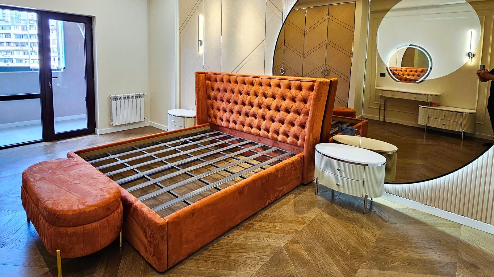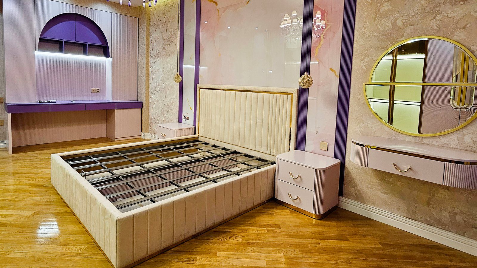

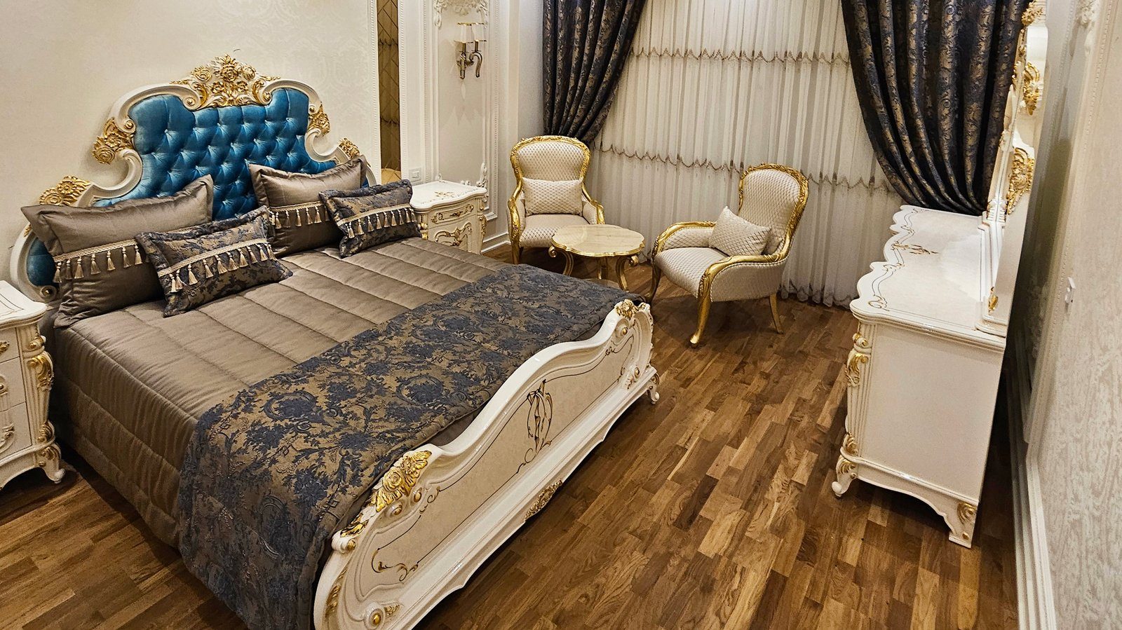
The bedroom is the room we least use to impress, yet the one we feel the most. Furniture here does more than fill space: the headboard, wardrobe and chest of drawers form a large part of the room's colour backdrop. Choosing their colour is therefore a practical question of light, size and daily routine as well as taste.
Start with the light
One and the same door finish looks chilly and grey in a north-facing bedroom and warm and glowing in a south-facing one. Before you pick a sample, work out what kind of light your room gets:
- Rooms with little sun. Warm light tones such as cream, ivory or a light oak decor add brightness. Cold white and bluish grey can look dull here.
- Very sunny rooms. Neutral and slightly cool tones make the room feel fresher. Dark fronts do not look too heavy, because the light keeps things balanced.
- Evening use. Bedrooms are mostly seen under artificial light. Always check the sample in the evening under your own lamps.
Room size and furniture volume
In a small bedroom, a large wardrobe in a dark colour pushes itself forward even more. A balanced approach is to keep bulky carcasses close to the wall tone and give smaller pieces, such as bedside tables and the headboard, a more expressive colour. In a large room the reverse applies: a dark wardrobe anchors the space and reduces a feeling of cold emptiness.
Ceiling height matters too. In a room with a low ceiling, a dark wardrobe to the ceiling can make it feel lower still; a lighter tone or a pale band at the top softens the effect.
Calming palettes
Soft transitions suit a bedroom better than sharp contrasts. Combinations that work well in practice:
- Natural wood and white. An oak or walnut decor carcass with white or milky fronts. Universal, warm and restful to the eye for years.
- Sand, beige and brown. Neighbouring earth tones. Combined with an upholstered headboard and linen textiles they create a soft atmosphere.
- Grey-green or olive. A colour associated with nature, calm without being dull. It pairs well with light wood decors.
- Deep blue or graphite. For the headboard wall or wardrobe in large, bright rooms. Balance it with light textiles and warm lighting.
Bright red, acid green and sharp yellow usually work best as small accents; across large furniture surfaces they tire the eye.
How many colours and materials
Two or three main tones are enough for bedroom furniture: for example, one wood decor, one neutral front colour and one accent such as a headboard fabric or a metal detail. When every piece has its own colour, the room looks scattered. Wood decors need care as well: a bed in one shade of oak, a wardrobe in another and a floor in a third will clash. It is better either to stick to one decor or to contrast wood tones clearly and deliberately. If the floor is already laid, bringing an offcut or a daylight photo of it to the sample selection prevents this mismatch.
Sheen, textiles and the long view
Matt and satin surfaces look calmer in a bedroom and do not reflect the lamps. Gloss can bounce light around a small room, but it may also create glare at night.
Furniture colour lasts longer than textiles. Curtains, duvet covers and rugs can change every few years, while a wardrobe stays for a long time. A sensible strategy is to give the furniture a more neutral base and leave colourful moods to elements that are easy to change.
A quick check before deciding:
- look at the sample in daylight and in the evening;
- place samples of the floor, wall and textiles side by side;
- think separately about the colour of the largest furniture surface;
- ask yourself whether you will still be comfortable with this colour in five years.
Zaferoglu Mebel draws on the wide decor ranges of Egger and Kronopol boards for bedroom furniture; the room's light and size can be taken into account together when choosing front and carcass samples.