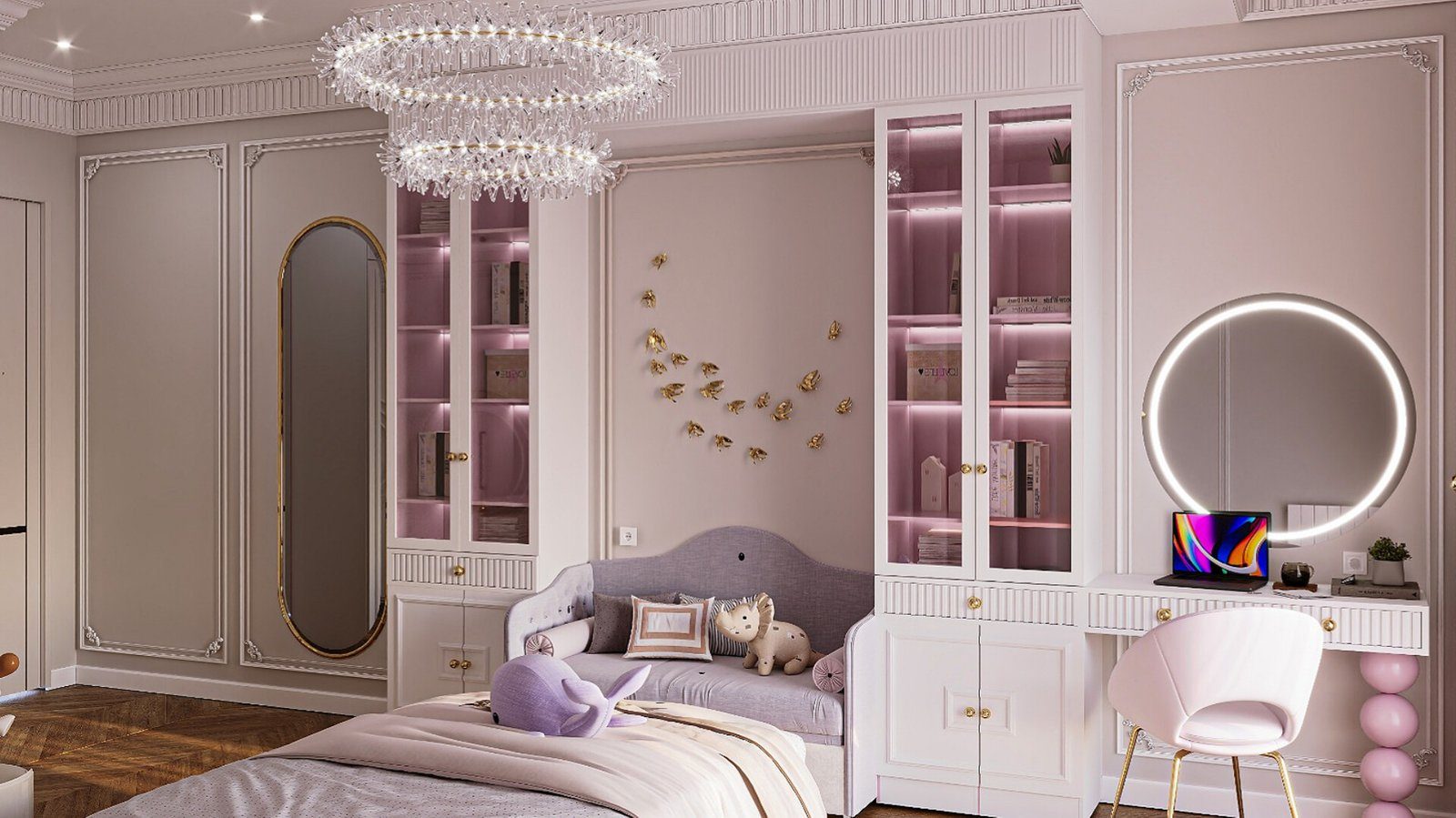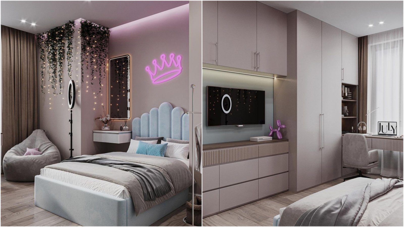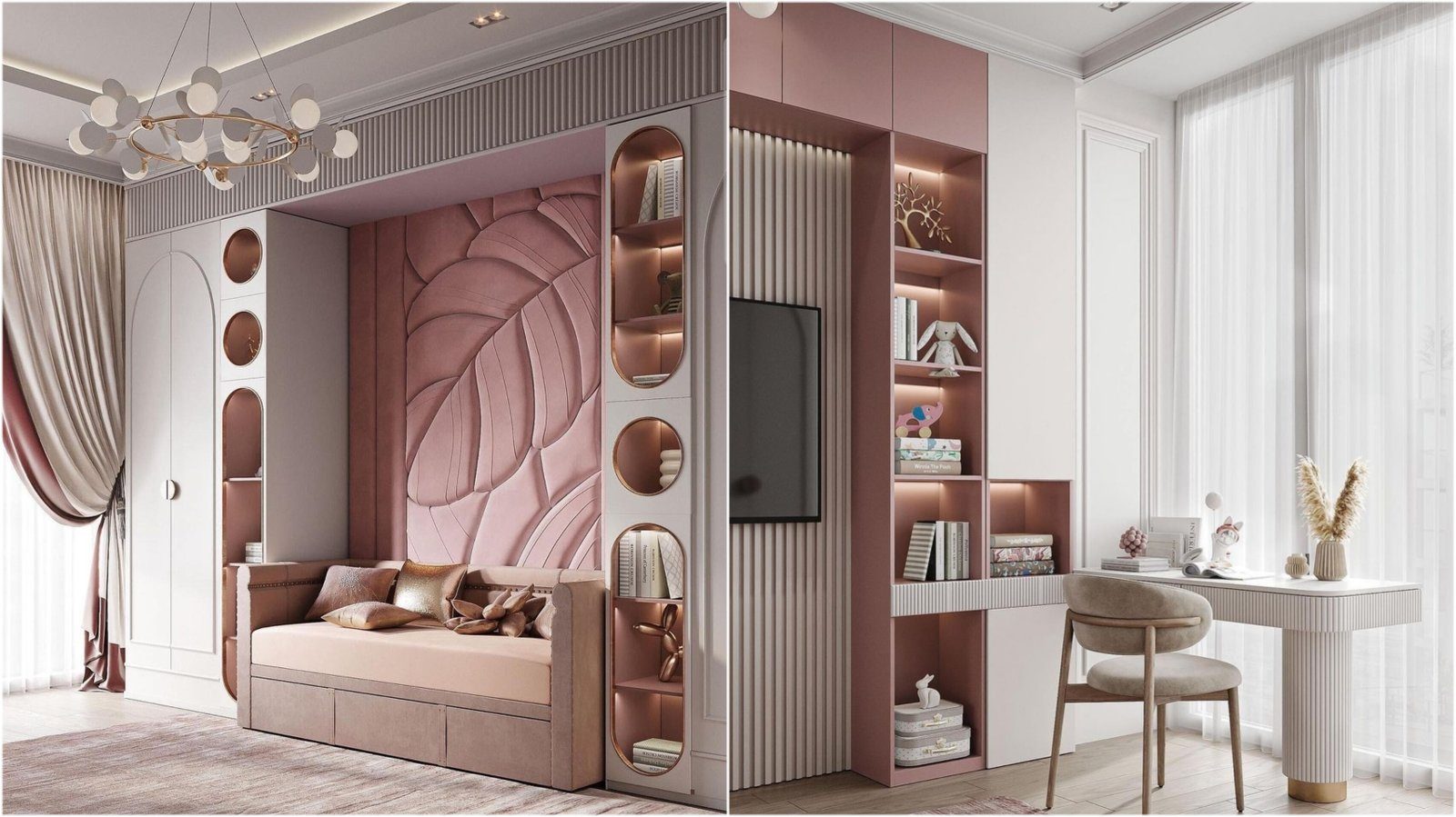

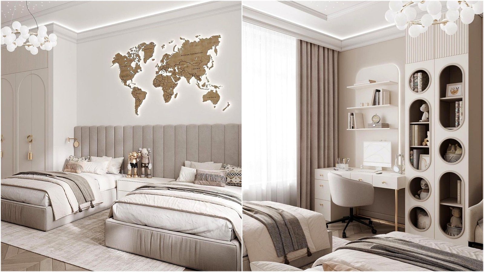
Parents choosing furniture for a child's room are often torn between two wishes. On one hand, bright yellow, green and blue fronts look cheerful and suit a child's world. On the other, those colours may feel babyish to the child a few years later, and the furniture has to be replaced. Neutral tones stay relevant for longer but can make the room look dull. The right answer is rarely either-or; it is about deciding which parts of the furniture carry colour and how much.
How colour affects a room
Colour changes a room's atmosphere. Bright, saturated tones create a sense of energy and liveliness and work well in a play area. But when the whole room is full of bright colours, the eye has nowhere to rest, and the calm needed for sleep is reduced.
Soft pastels and neutrals such as white, beige, light grey and light wood create a calm backdrop. Against them, toys, books and the child's drawings become the colour accents themselves. A very cool, entirely grey palette, though, can look overly serious in a child's room.
There are many claims about the psychological effects of colour, but much depends on individual perception. In practice, the key criterion is simple: the child should be able both to play and to calm down and sleep in the room.
Neutral carcass, changeable accents
The most flexible approach is to keep large, costly parts of the furniture neutral and make small, easily replaced parts colourful. For example:
- A wardrobe carcass and main fronts in white or light wood, with one or two coloured drawer fronts.
- A neutral bed with a colourful bedspread and cushions.
- A light shelving system with colourful storage boxes.
- Neutral furniture with coloured handles; changing the handles changes the room's character.
With this approach, as the child grows only a few fronts, handles and textiles are updated, while the main furniture stays.
Needs that change with age
In a nursery, parents' convenience and a calm atmosphere come first. Soft, light tones suit night feeds and sleep. In the preschool years, children respond strongly to colour and start to show their favourites; one or two bright accents add cheerfulness.
At school age, the study area needs particular attention. Very bright, mixed colours around the desk can be distracting, so the desk and nearby shelves are kept calmer. In adolescence, children often reject childhood colours and want more grown-up tones. If the furniture's base is neutral, this transition is easy.
Involving the child
Letting a child take part in choosing colours strengthens their attachment to the room. Rather than giving free rein over the whole palette, though, it works better to offer a choice between a few suitable options. For example, a parent selects three drawer colours and the child picks one.
A child's favourite colour today may change within a year. Using it on easily replaced parts, such as textiles, boxes or a single front, respects their wish and leaves room for future change.
Materials and practicality
Colour choice should not be separated from practicality. In a child's room, surfaces are constantly tested by markers, modelling clay, glue and handprints. Pure white gloss shows every mark; matt, lightly textured or wood-effect surfaces are more forgiving. Very dark colours show dust and scratches.
Finishes have to put up with regular cleaning. Laminated board and good-quality foil handle a damp cloth without trouble. With painted fronts, ask whether the paint is approved for children's furniture and meets safety rules.
A simple rule for colour balance
A common designer rule is one dominant neutral, one or two supporting shades and a single accent. For a child's room that could be neutral walls and big furniture, a supporting tone in the floor and textiles, and a handful of small bright details. Look at samples in that room by daylight and again under evening lamps.
Zaferoglu Mebel makes children's furniture in many colours and decors; seeing on the sketch which fronts form the neutral base and which carry the accent makes the choice much easier.