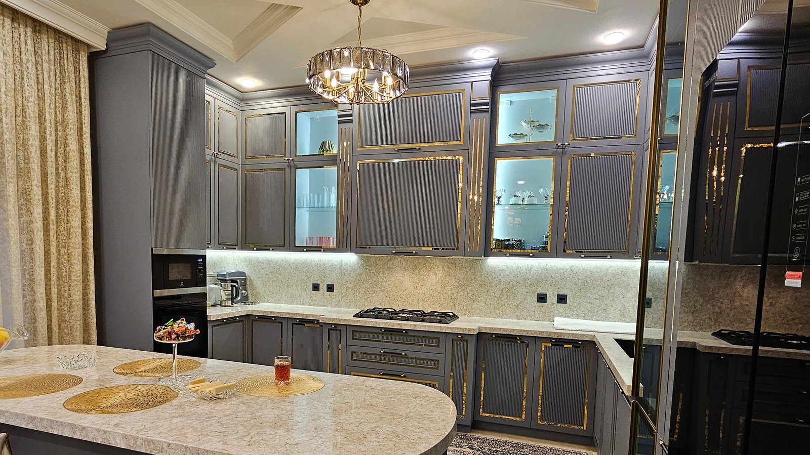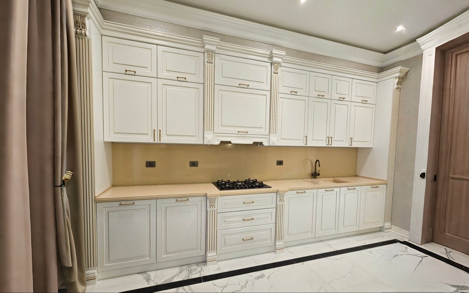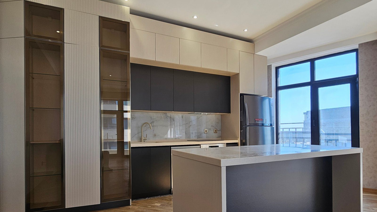

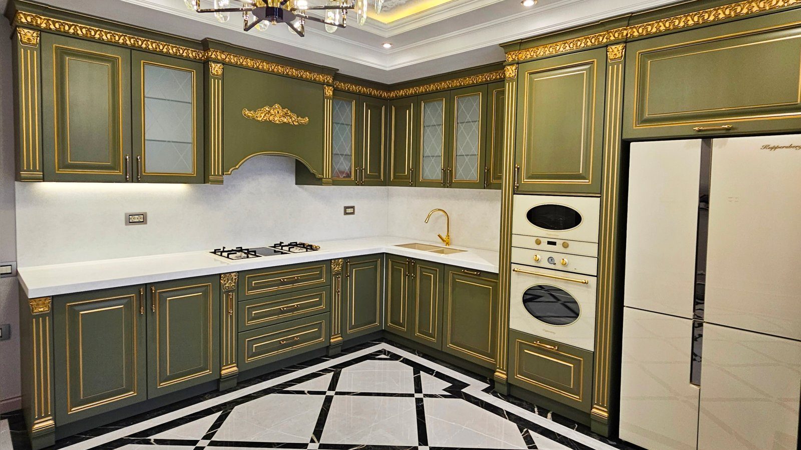
Kitchen colours are often chosen from a small sample or a catalogue photo. But the same colour looks completely different in a narrow north-facing kitchen, in a spacious south-facing kitchen-living room and under an evening lamp. Three factors shape how a colour is perceived: the direction and amount of daylight, the size and shape of the room, and the colour temperature of artificial light. Taking them into account prevents regrets later.
Window direction and the colour of light
Daylight carries a different tint depending on the time of day and which way the window faces. General observations are:
- in north-facing rooms the light is even but cool and slightly grey, so cool colours such as pale grey and blue look even colder;
- south-facing rooms get strong, warm light through the day, so warm colours can look too yellow while cool colours can balance out;
- an east-facing kitchen is bright and warm in the morning and shaded in the evening;
- a west-facing kitchen is calm in the morning and filled with warm, reddish light in the late afternoon.
So in a north-facing kitchen, colours with warm undertones such as cream, warm white, beige and warm wood decors feel more comfortable. In a south-facing kitchen, cool and neutral colours also work well.
Room size
In a small kitchen, light-coloured fronts reflect light and push the walls back visually. That does not mean a small kitchen must be white. There are several approaches:
- light wall units and dark base units, grounding the room while keeping the upper part light;
- fronts close in colour to the walls, so the units blend in and the volume seems smaller;
- a dark colour used on just one element, such as an island or one run.
In a large kitchen, dark and saturated colours can be used more freely. Over a large area, deep blue, deep green or graphite fronts make the space more intimate and rich. Very light colours can make a large kitchen feel slightly cold and empty.
Ceiling height and number of rows
In a kitchen with a low ceiling, dark wall units up to the ceiling make it feel lower still. It is better to choose wall units in a light colour or the wall colour, or to replace part of the top row with open shelves. In a kitchen with a high ceiling and two rows of wall units, making the top row a slightly different, lighter tone balances the height.
Artificial light and colour
In the evening a kitchen runs on artificial light, and colours depend on the colour temperature of the lamps. Under warm light a cool grey front can look slightly beige; under cool light a warm cream can look grey and lifeless. Worktop lighting and front colour should be chosen together.
Colour rendering quality also matters: poor-quality light sources make colours look washed out and distorted.
Testing a sample properly
These steps avoid surprises when choosing a colour:
- view the sample as large as possible, since a small piece makes a colour look lighter;
- take the sample home and check it upright against the kitchen's own wall;
- look at it morning, midday and evening, in daylight and under lamps;
- compare it together with floor, wall paint and worktop samples;
- remember that the same colour looks different in matt and gloss.
Matching colour with the rest of the kitchen
Front colour is never seen alone but alongside the worktop, splashback, handles and floor. If you choose a busy multi-coloured worktop, keep the fronts calm. If the front colour is bold, the worktop and splashback should be neutral. In an open-plan kitchen, the living room colours also become part of the palette.
Zaferoglu Mebel designs kitchens to measure. When it comes to colour, saying which way the window faces and showing photos of the kitchen by day and in the evening leads to far more accurate advice.